Table of Contents
- Introduction
- Key Metrics Summary
- Filters and Interaction
- Trend Visualizations
- NPS Trends – Drill-Down and Tooltip Interaction
- Channel Performance Trends – Drill-Down and Tooltip Interaction
- Star Rating Trends – Drill-Down and Tooltip Interaction
Introduction
The Trends page in QEval helps users track and visualize survey performance over time. It provides insights into customer sentiment, satisfaction trends, and performance comparisons across agents, supervisors, clients, brands, channels, and programs. The information is presented through interactive charts and summary cards for easy analysis.
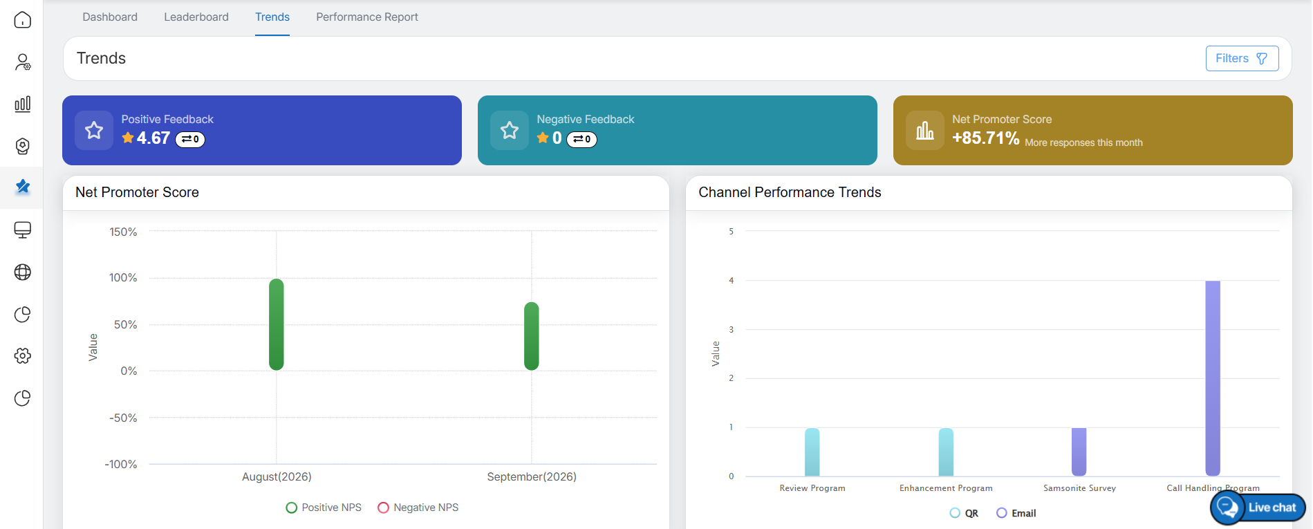
Trends Dashboard
Key Metrics Summary
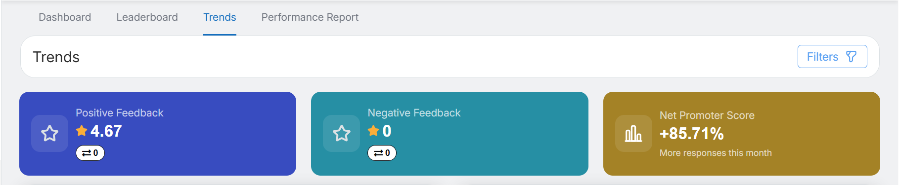
At the top of the Trends page, summary cards provide a quick overview of overall performance metrics for the selected date range:
Key Metrics
-
Positive Feedback
-
Displays the average positive feedback rating for the selected period.
- Includes an upward or downward trend indicator to compare performance with the previous equivalent period.
-
-
Negative Feedback
-
Shows the average negative feedback rating.
- Includes a trend indicator showing whether performance has improved or declined compared with the previous period.
-
-
Net Promoter Score (NPS)
-
Displays the overall NPS value for the selected date range.
-
Shows the percentage change compared to the previous period (for example, +41.62% more responses this month) to indicate change in response percentage.
-
These cards provide a quick overview of customer sentiment and satisfaction trends.
Filters & Interaction
Available Filters
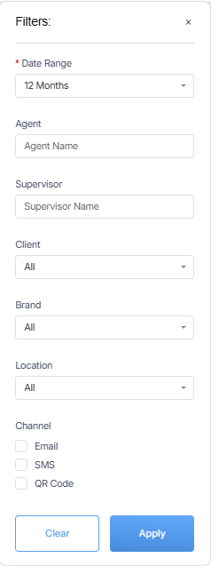
Users can refine trend data using the following filters:
- Date Range (1, 3, 6, or 12 months; default is 1 month)
- Agent
- Supervisor
- Client
- Brand
- Location
- Channels (Email, SMS, QR Code – checkbox selection)
Filters
Filter Behavior
- All charts, cards, and metrics update dynamically when filters are applied.
- Default filter state is set to All for Agent, Supervisor, client and Brand.
- Selecting a date range refreshes all trend-based visualizations.
Trend Visualizations
Net Promoter Score Trend
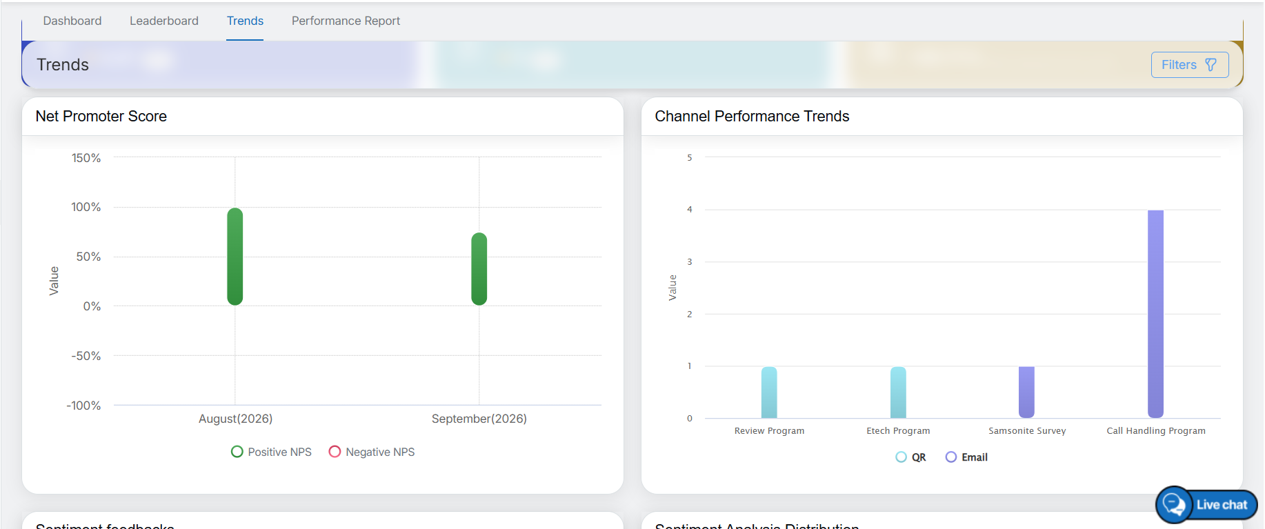
- Displays month-wise NPS performance for the selected 12-month date range, as shown in the image below.
- Visually differentiates positive and negative NPS values.
- Helps track changes in customer loyalty over time.
Channel Performance Trends
- Displays a stacked bar chart showing performance by Email, SMS, and QR Code.
- Enables comparison of response volume and performance across channels.
- Useful for identifying the most effective survey distribution channel.
Net Promoter Score and Channel Performance Trends
NPS Trends – Drill-Down and Tooltip Interaction
The NPS Trends report supports a structured drill-down with interactive tooltips for detailed performance analysis.
NPS Trend Level:
The chart displays NPS trends over time. Hover over the chart to view tooltips with key metrics for quick analysis. Users can click any specific month in the NPS trend to initiate the drill-down.
- Month Level:
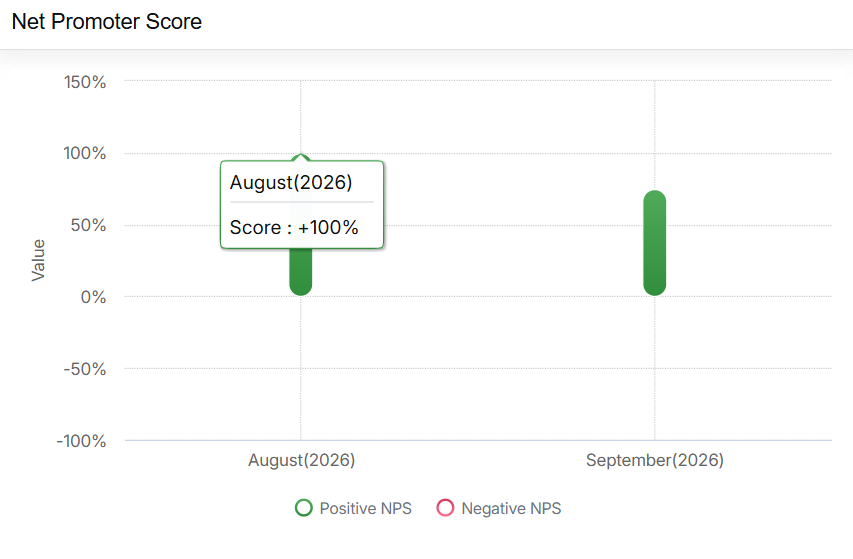
Net Promoter Score: Month Level
- Supervisor Level:
At the Supervisor level, performance data is displayed for supervisors associated with the selected month. Use the dropdown in the top-right corner of the chart to switch between the Top 5 and Bottom 5 Supervisors based on NPS performance. Hover over the chart to view supervisor-level metrics.
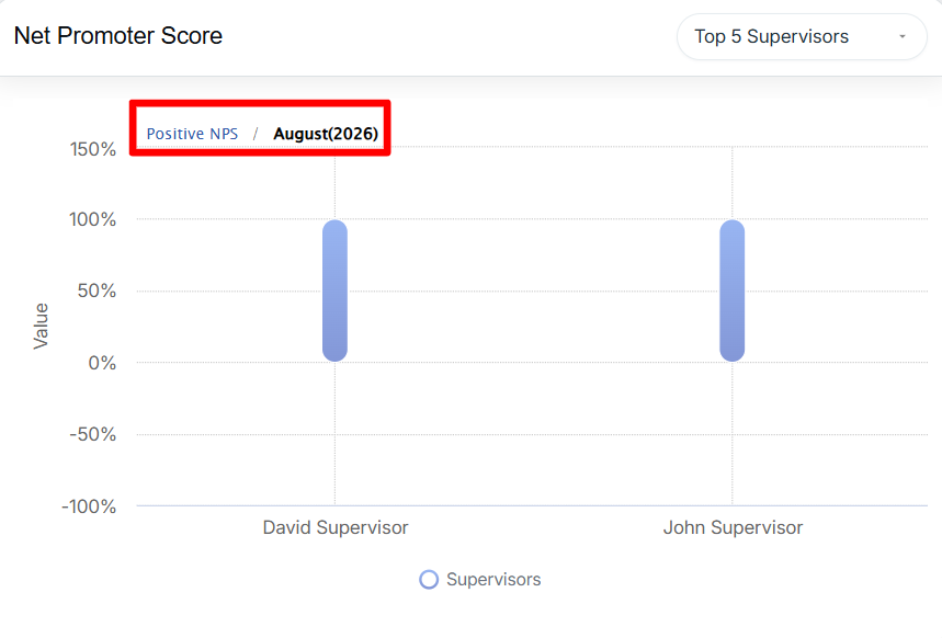
Net Promoter Score: Supervisor Level
- Agent Level:
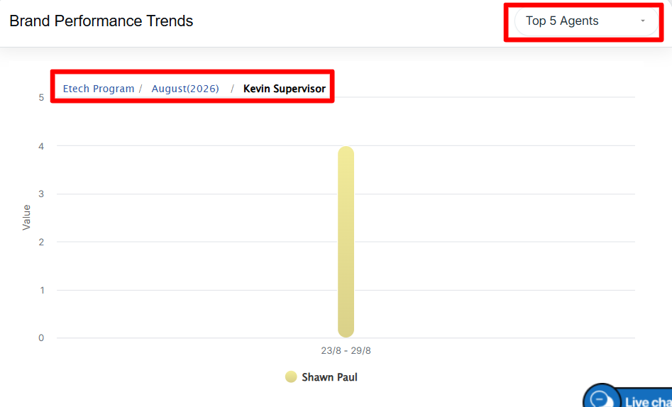
Selecting a Supervisor drills down to the Agent level, displaying agents reporting to the selected supervisor. Use the dropdown in the top-right corner of the chart to switch between the Top 5 and Bottom 5 Agents based on NPS performance. Hover over the chart to view agent-level NPS metrics and values.
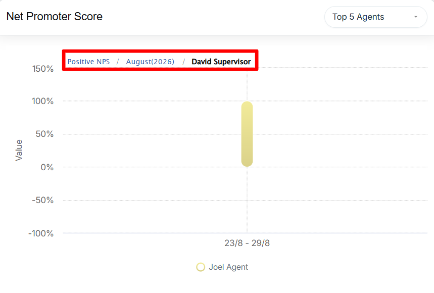
Net Promoter Score: Agent Level
This drill-down flow—Month → Supervisor → Agent—enables focused analysis of NPS performance across time and organizational levels, supported by clear and informative tooltips.
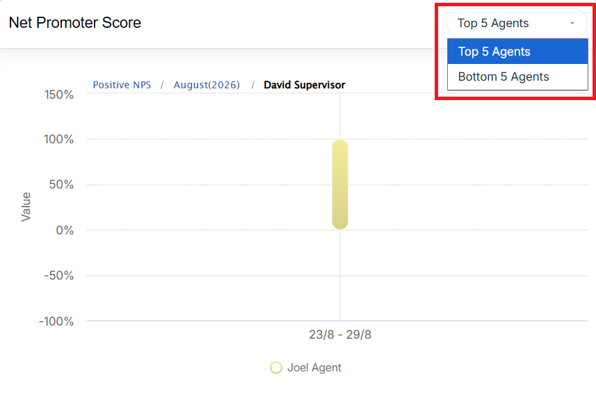
Top 5 Agents
Channel Performance Trends – Drill-Down and Tooltip Interaction
The Channel Performance Trends report provides interactive drill-down and tooltip functionality to analyze performance across survey distribution channels.
-
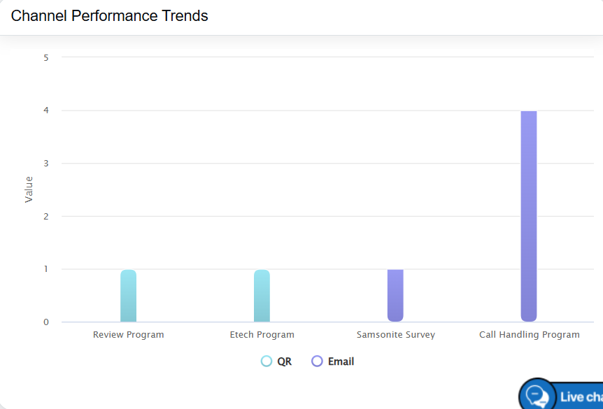
Channel Level:
Channel Performance Trends
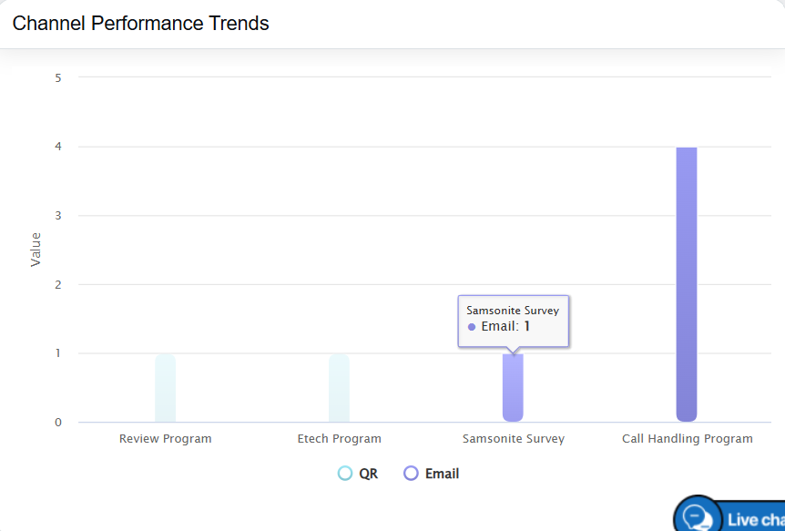
Hovering over each channel displays tooltips with response volume and performance metrics. Users can click on a specific channel to drill down and view more detailed performance data.
Channel Performance Trends
-
Supervisor Level:
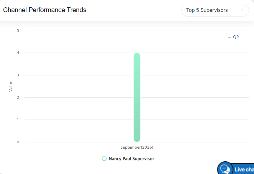
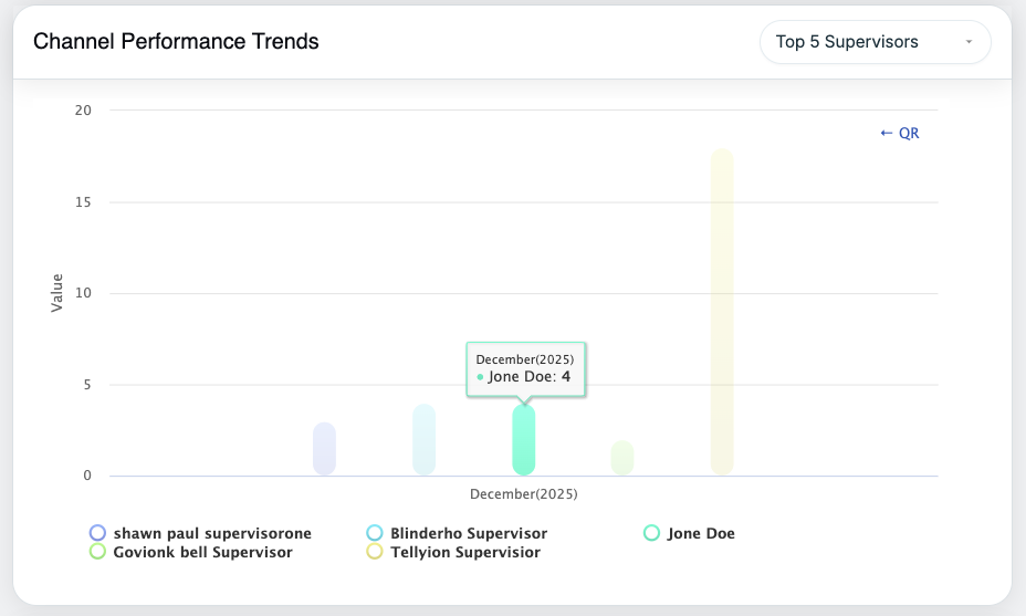
After selecting a channel, the performance data is displayed at the Supervisor level. Use the dropdown in the top-right corner of the chart to switch between the Top 5 and Bottom 5 Supervisors based on channel performance. Hover over the chart to view detailed performance metrics for each supervisor.
Channel Performance Trends: Supervisor Level
Channel Performance Trends: Supervisor Level
-
Agent Level:
Selecting a Supervisor drills down to the Agent level, displaying agents who report to the selected supervisor. Use the dropdown in the top-right corner of the chart to switch between the Top 5 and Bottom 5 Agents based on channel performance. Hover over the chart to view detailed agent-level performance metrics.
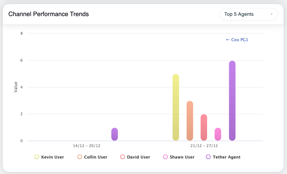
Channel Performance Trends
This drill-down path—Channel (Email / SMS / QR Code) → Supervisor → Agent—helps users identify the most effective survey channels and evaluate performance at both the supervisor and agent levels.
Sentiment Feedback Trends
- Displays month-wise Positive and Negative sentiment percentages.
- Automatically compares the current month’s sentiment with the previous month.
- Helps identify sentiment shifts over time.
Sentiment Analysis Distribution
-
Circular chart showing overall sentiment split:
-
Positive
-
Neutral
-
Negative
-
-
Displays total feedback count and percentage for each sentiment type.
-
Progress bars provide quick visual comparison.
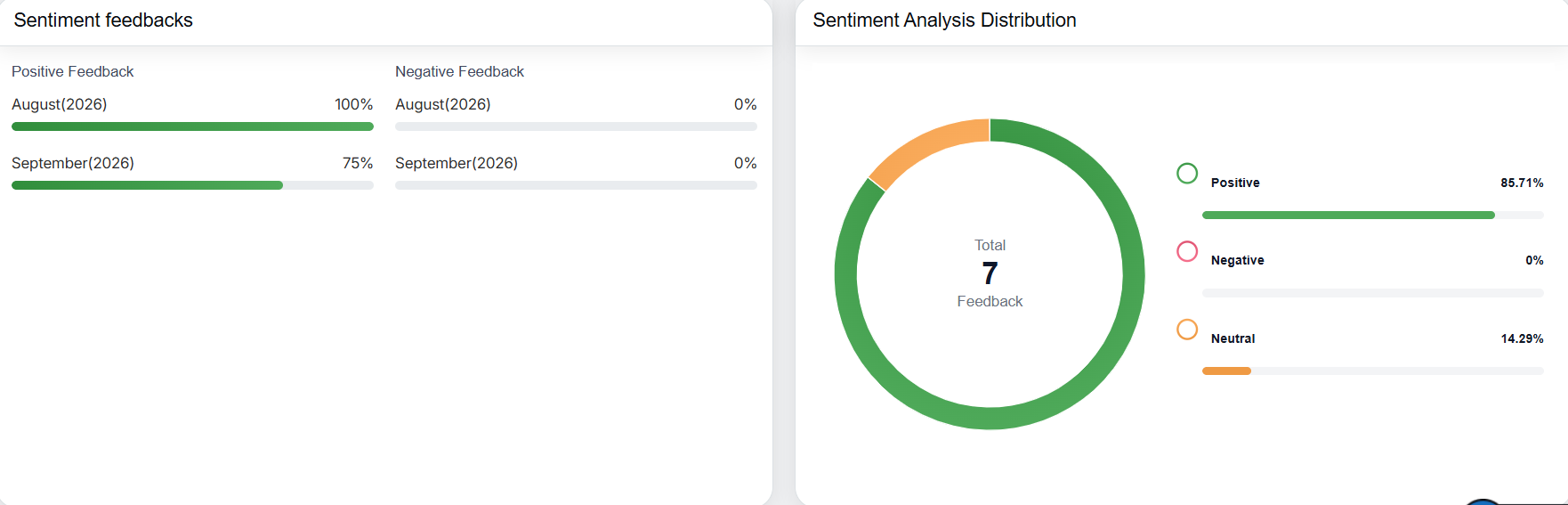
Sentiment Feedbacks and Sentiment Analysis Distribution
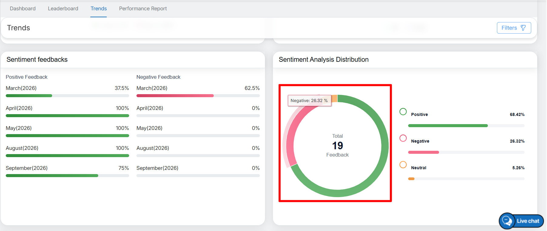
Sentiment Metrics
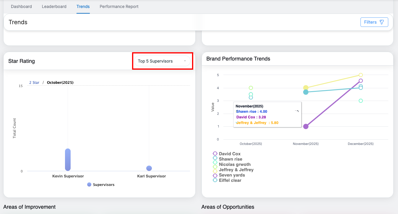
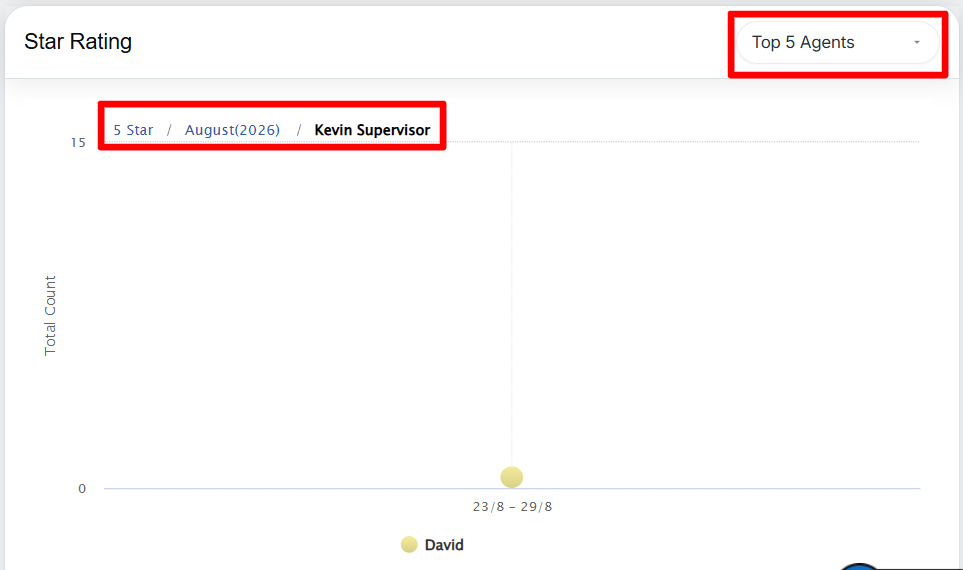
Star Rating Trends
-
Line chart displaying trends for:
-
1-star to 5-star ratings
-
Average rating
-
-
Shows month-wise distribution and changes in rating patterns.
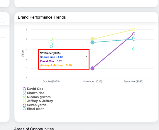
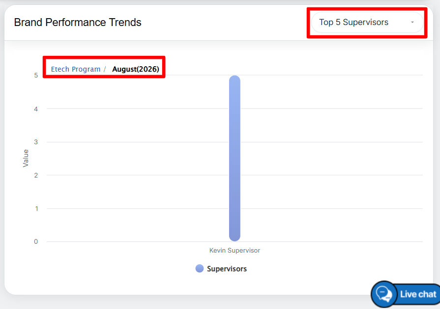
Brand Performance Trends
-
Displays brand-wise performance across months.
-
On hover, users can view:
-
Month
-
Brand name
-
Average rating
-
-
Useful for comparing performance between multiple brands.
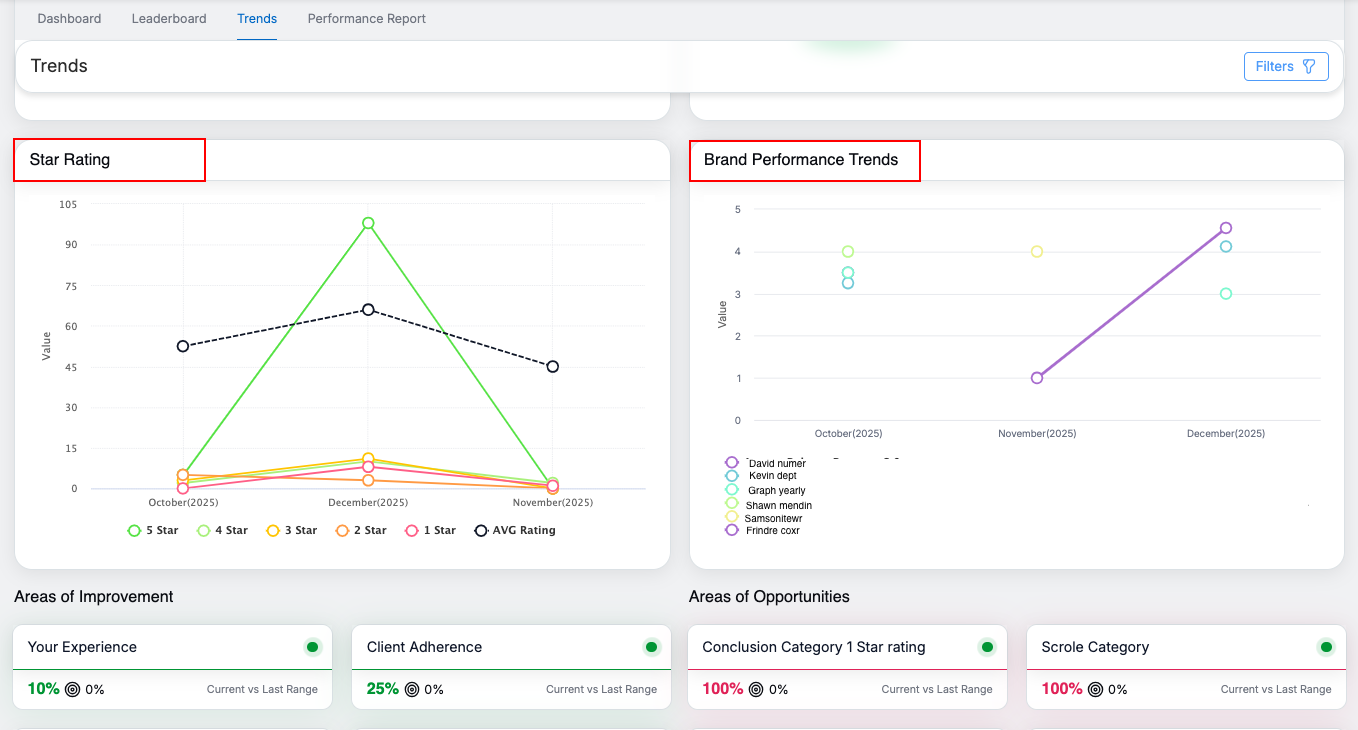
Star Rating and Brand Performance Trends
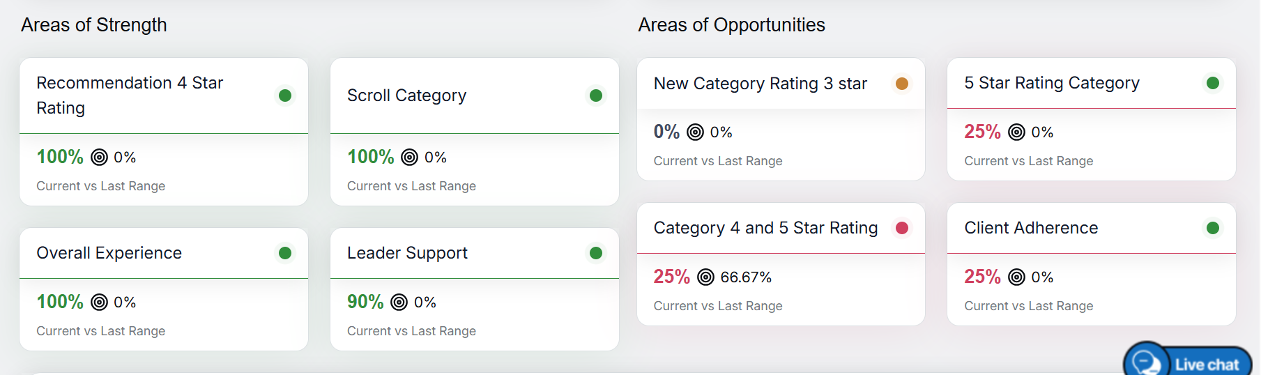
This section highlights key focus areas based on survey insights. The displayed categories dynamically adapt to the selected survey form configuration, so the categories may vary depending on how each survey form is configured.
Example categories may include:
- Customer Experience
- Client Adherence
- Recommendation Ratings
- Service Categories
Categories
Each card shows:
- Current percentage
- Comparison with the previous equivalent period
This helps teams quickly identify improvement areas and growth opportunities relevant to each survey.
Detailed Sentiment Analysis

Detailed Sentiment Analysis
-
Displays sentiment breakdown with progress bars for:
-
Positive
-
Neutral
-
Negative
-
-
Shows:
-
Total response count
-
Percentage contribution
-
-
Provides a deeper understanding of overall customer sentiment.
Key Notes
- All data displayed reflects the currently applied filters.
- Charts and graphs are interactive, allowing users to analyze the data in greater detail.
- The Trends page helps users track performance, understand sentiment patterns, and identify actionable insights efficiently.
Video