Introduction
The Performance Report provides a consolidated view of customer feedback and survey performance. It helps users analyze and compare agent, team, channel, tag, and brand performance using interactive charts, visual insights, and filters.
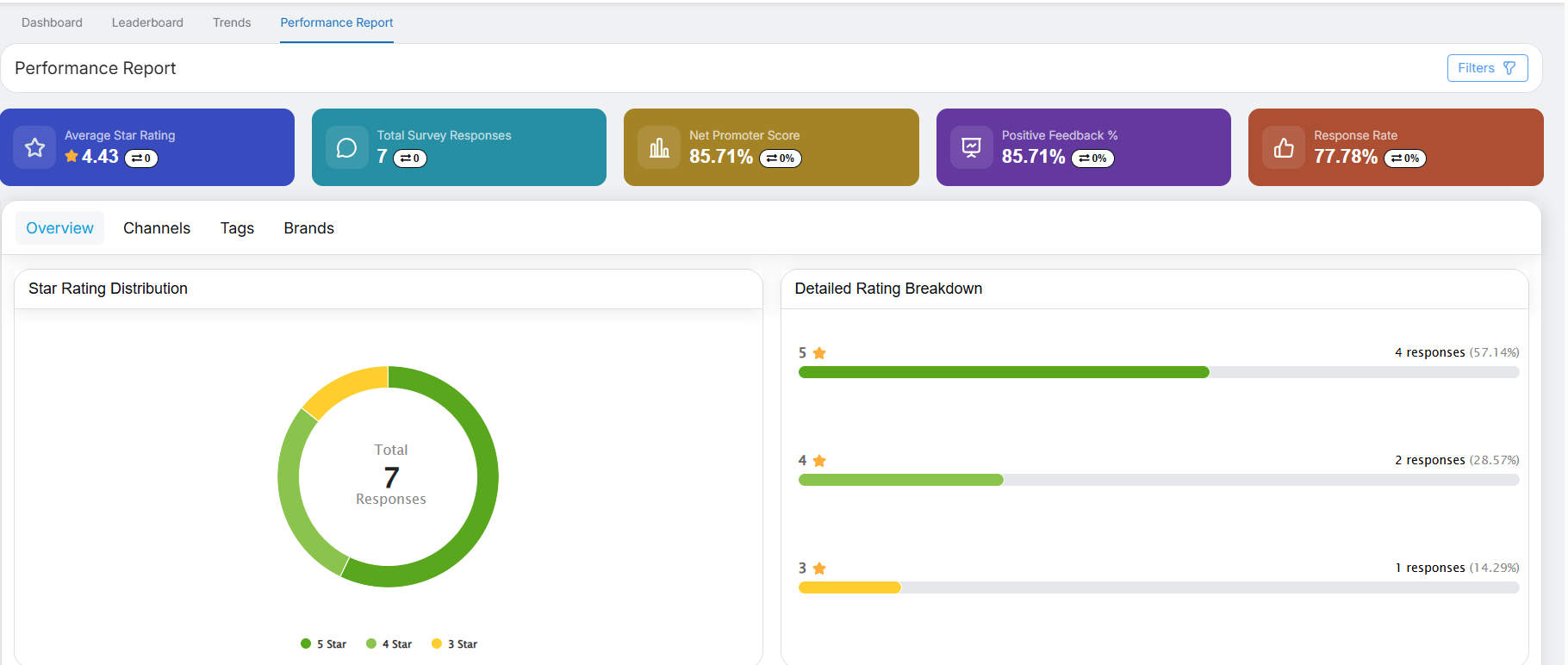
By default, the report displays data for the last 1 month. The metrics and charts automatically update based on the filters selected.
Summary Metrics (Top Cards)
At the top of the Performance Report, five summary cards provide an overview of the key performance indicators.

- Average Star Rating
Displays the overall average rating based on survey responses, along with a change indicator that shows how the rating has changed compared to the previous period.
Example: 4.44 (▲ +0.04) - Total Survey Responses
Shows the total number of survey responses received, along with a change indicator that reflects the increase or decrease compared to the previous period.
Example: 120 (▲ +110) - Net Promoter Score (NPS)
Indicates customer loyalty and the likelihood of customers recommending the brand, along with a change indicator.
Example: 74.17% (▼ -5.83%) - Positive Feedback %
Represents the percentage of positive feedback received from survey responses, along with a change indicator showing the trend compared to the previous period.
Example: 82.5% (▼ -7.5%) - Response Rate
Shows the percentage of completed surveys out of the total surveys sent, along with a change indicator showing the variation compared to the previous period.
Example: 96% (▲ +19.08%)
Note: Green indicators represent an improvement, while red indicators represent a decline compared to the previous period.
Filters & Interaction
- The Filters button is available in the top-right corner of the report.
- Filters support both single-select and multi-select options.
- After applying filters, all summary cards and charts automatically update to reflect the selected criteria.
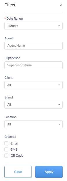
Users can refine Performance Report data using:
- Date Range (1, 3, 6, 12 months or custom date range; default is 1 month)
- Agent
- Supervisor
- Client
- Brand
- Location
- Channels (Email, SMS, QR Code – checkbox selection)
Filter Behavior
- All cards, charts, graphs, and metrics update automatically when filters are applied.
- By default, the Agent, Supervisor, Client, and Brand filters are set to All.
- Changing the date range updates all performance visuals and metrics accordingly.
Tabs in Performance Report
The Performance Report contains four tabs:
- Overview
- Channels
- Tags
- Brands
Overview Tab
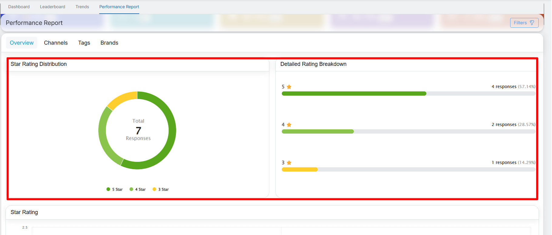
The Overview tab presents star rating insights through three visual components.
1. Star Rating Distribution
- Displays a donut chart showing the distribution of ratings from 1 star to 5 stars.
- The center of the chart displays the total number of responses.
- Each star rating category is represented using a different color and is identified in the legend.
- Hover over a segment to view a tooltip showing the response count and percentage contribution for the selected rating.
2. Detailed Rating Breakdown
- Displays a horizontal breakdown for each star rating from 1 to 5.
- Shows the following for each rating:
- Number of responses
- Percentage contribution
- Helps users quickly identify the most common rating categories.
3. Star Rating
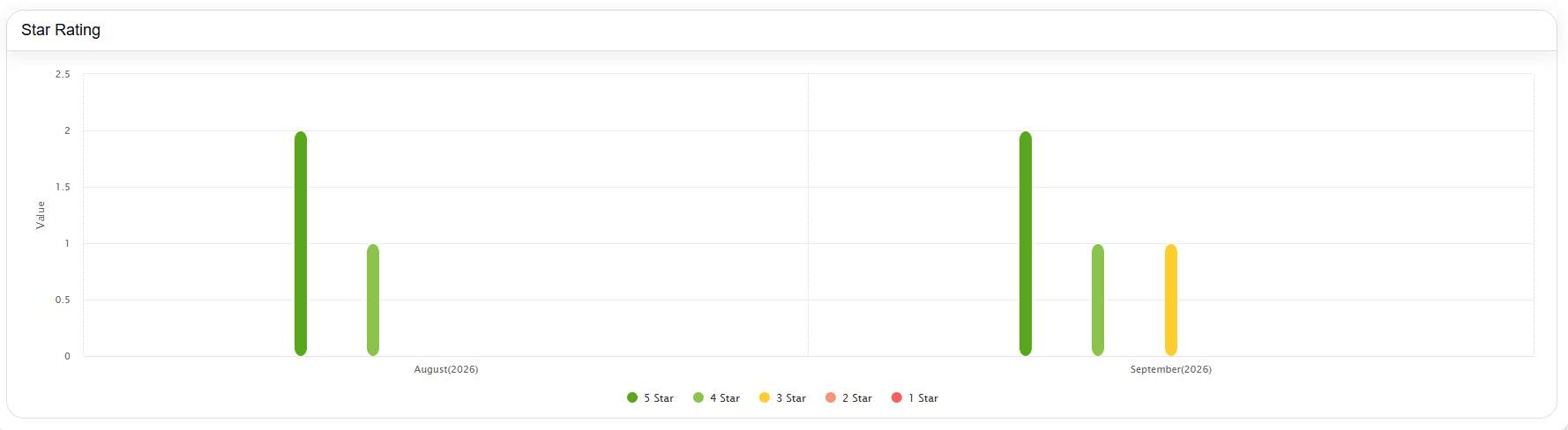
- Displays a bar chart showing the number of responses received for each star rating on a monthly basis.
- Includes separate bars for:
- 1 Star
- 2 Star
- 3 Star
- 4 Star
- 5 Star
- Hover over a bar to view detailed tooltip information for the selected month and star rating.
- The chart automatically updates based on the filters applied.
Channels Tab
The Channels tab provides channel-wise performance insights.
Channel Summary Cards
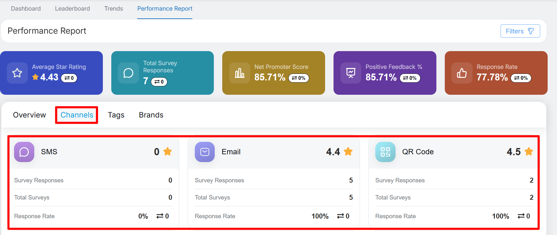
The Channels tab displays summary cards for each channel, including SMS, Email, and QR Code, providing a quick overview of survey performance for each channel.
Each card shows:
- Average Rating
- Survey Responses
- Total Surveys
- Response Rate (with trend indicator)
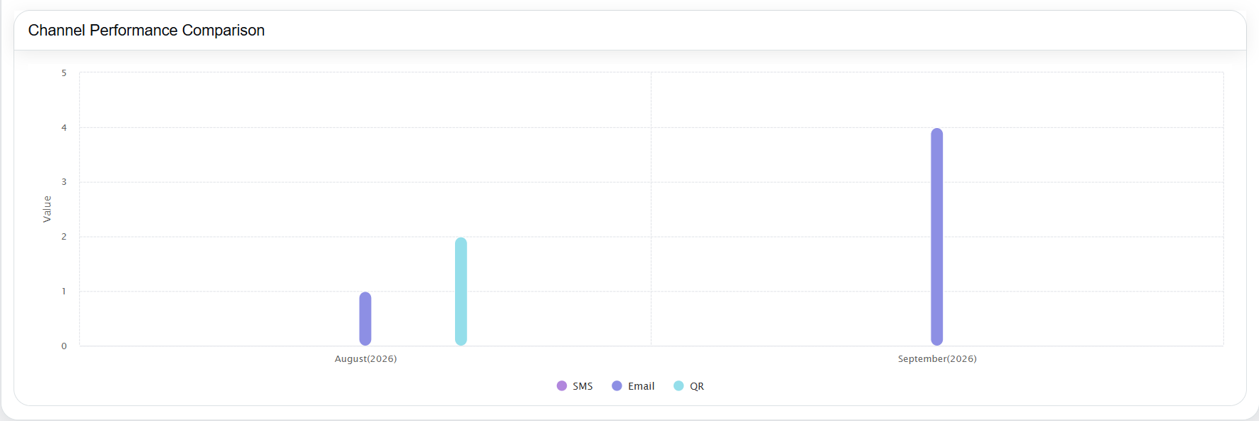
- Displays a bar graph comparing channel performance over time.
- Includes the following channels:
- SMS
- QR
- Hover over a bar to view tooltip details, including the month, channel name, and response count.
Tags Tab
The Tags tab highlights commonly mentioned feedback tags.
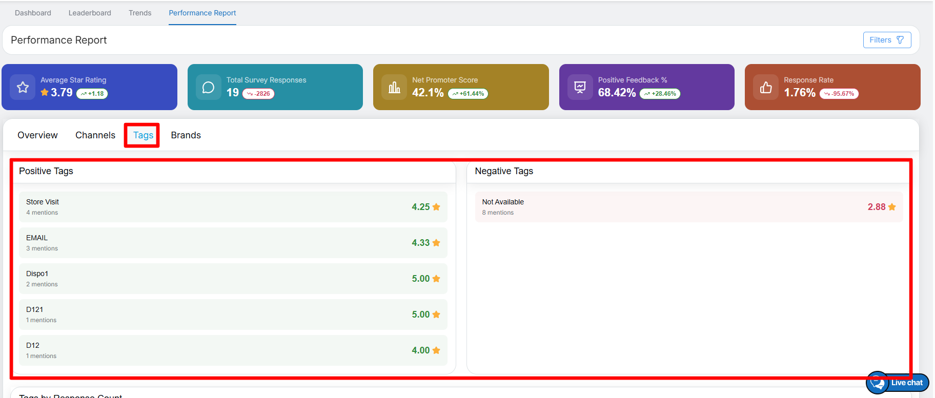
Positive Tags
Displays the top positive tags identified from survey feedback, along with the number of mentions and average rating for each tag.
Negative Tags
Displays the most frequent negative tags identified from survey feedback, along with the number of mentions and average rating for each tag.
Tags by Response Count
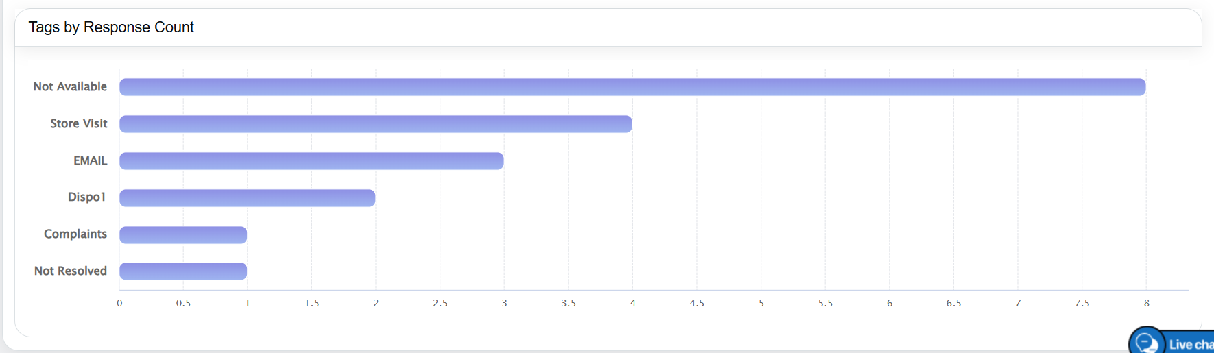
- Displays a horizontal bar chart listing all tags.
- Each bar represents the number of responses per tag.
- Hover over a bar to view the exact response count.
Brands Tab
The Brands tab provides brand-wise performance insights.
Brand Summary Cards
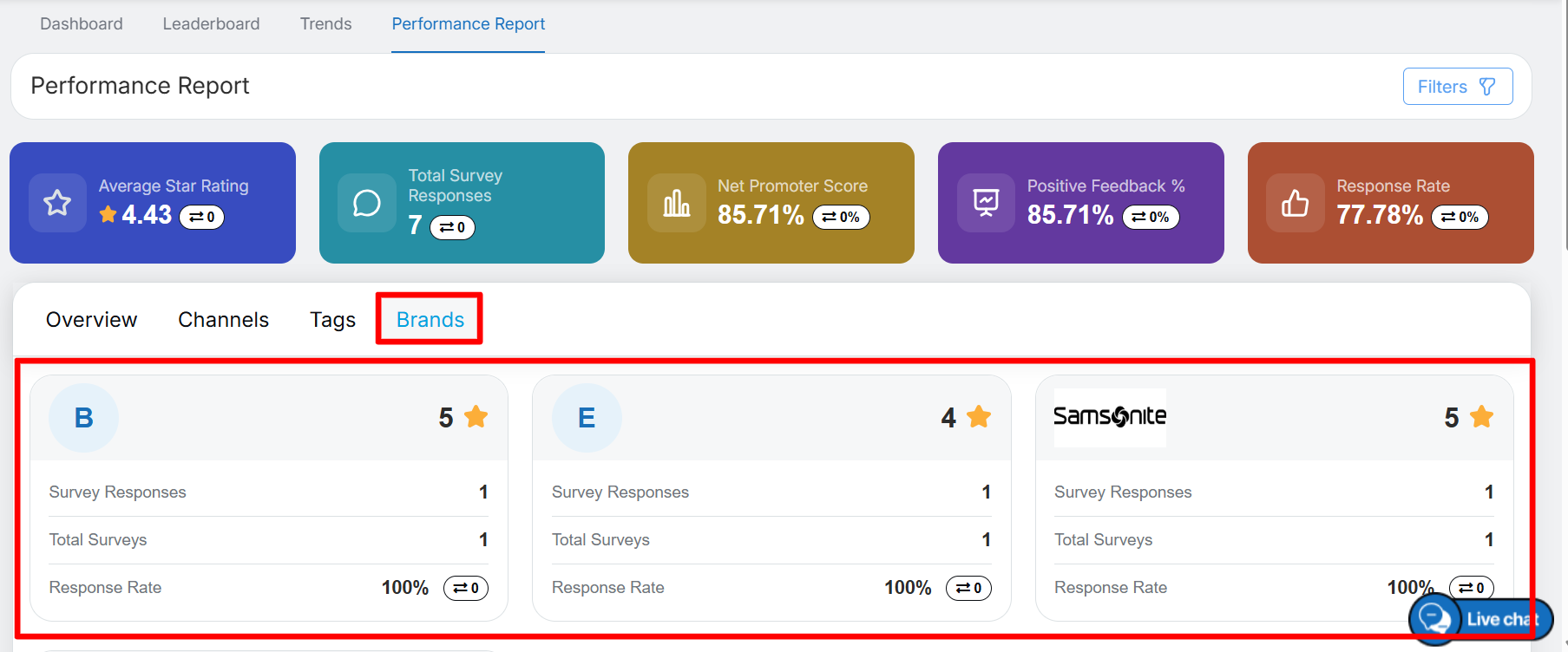
Quick cards present key performance metrics for each brand, including:
- Average rating
- Survey responses
- Total surveys
- Response rate (with trend indicators where applicable)
Example:
Brand B – Avg. Rating: 4.09 | Responses: 32/33 | Response Rate: 96.97% (▼ 3.03%)
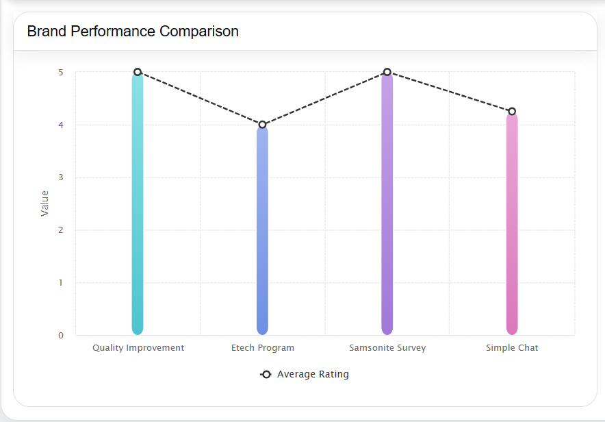
Brand Performance Comparison
- Displays a graph comparing average ratings across brands.
- Brand names are shown on the axis with corresponding rating values (1–5 scale).
- The chart automatically updates when filters are applied.
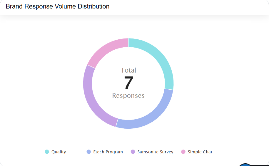
Brand Response Volume Distribution
- Displays a donut chart showing the proportion of responses for each brand.
- The center of the chart displays the total number of responses.
- Each brand is represented by a distinct color-coded segment with a corresponding legend.
 Key Notes
- All charts are interactive and support hover-based tooltips.
- Data automatically updates based on the selected filters.
- When no filters are applied, the system displays default data for the last 1 month.
Video