Table of Contents
Admin
The Admin is the highest-level user role in the QEval application and has complete access to all system features and configurations.
An Admin can:
- Create users and assign any available user role.
- Manage user permissions by granting or revoking access rights.
- Monitor and track activities performed by all user roles.
- Configure system settings and manage application features.
- View and access all reports available in QEval.
After logging in with a valid Admin User ID and Password, the system redirects the user to the Admin Dashboard.
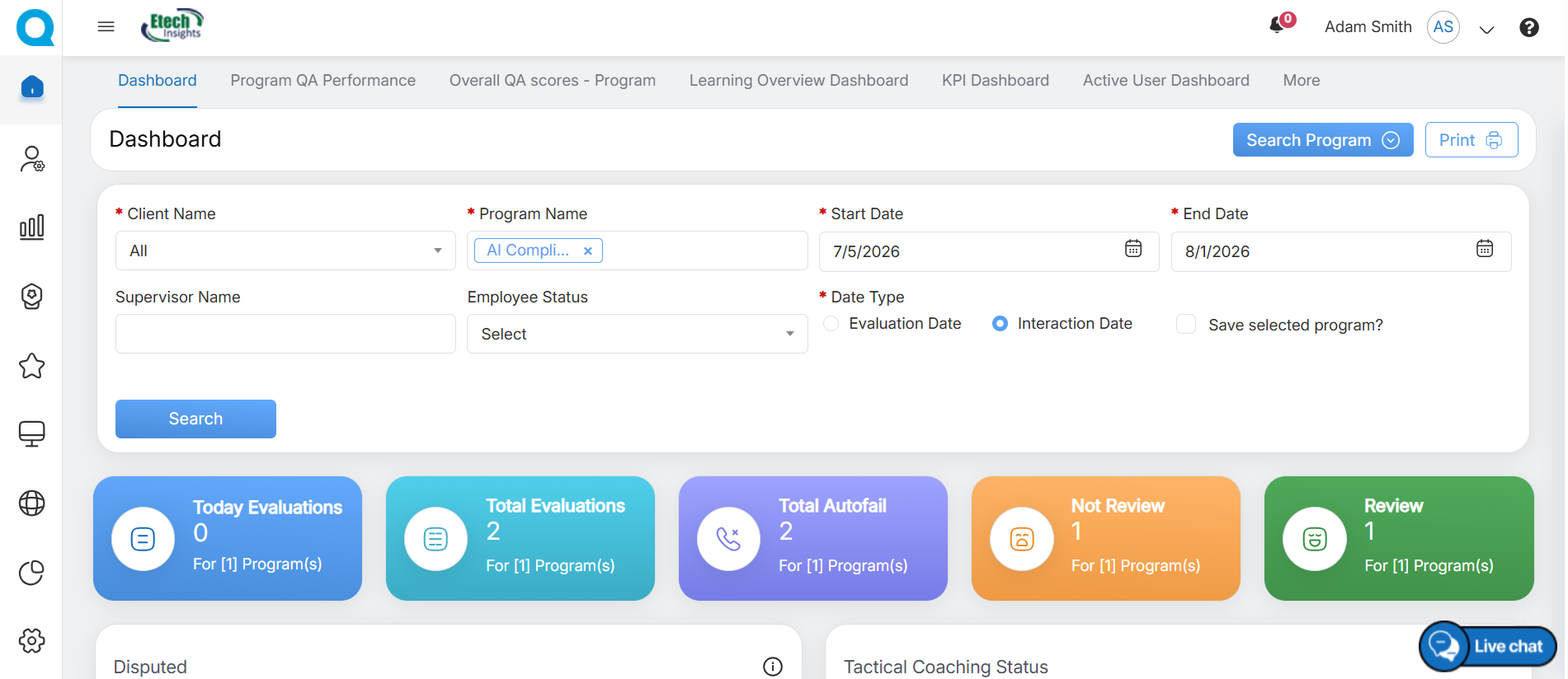
Admin Dashboard
Admin console includes the operational tabs like – Home, Manage, KPI, Quality, Survey, Coaching, My Universe, Reports, Settings, and Admin.
Note: The above-mentioned tabs are based on access rights. Admin can assign separate rights to the individual users. To know about the access rights of Admin, refer to Users Access Control.
Admin Home Page
Admin will have access to six main tabs on the home page:
- Dashboard
- Program QA Performance
- Overall QA scores – Program
- Learning Overview Dashboard
- KPI Dashboard
- Active User Dashboard
Dashboard
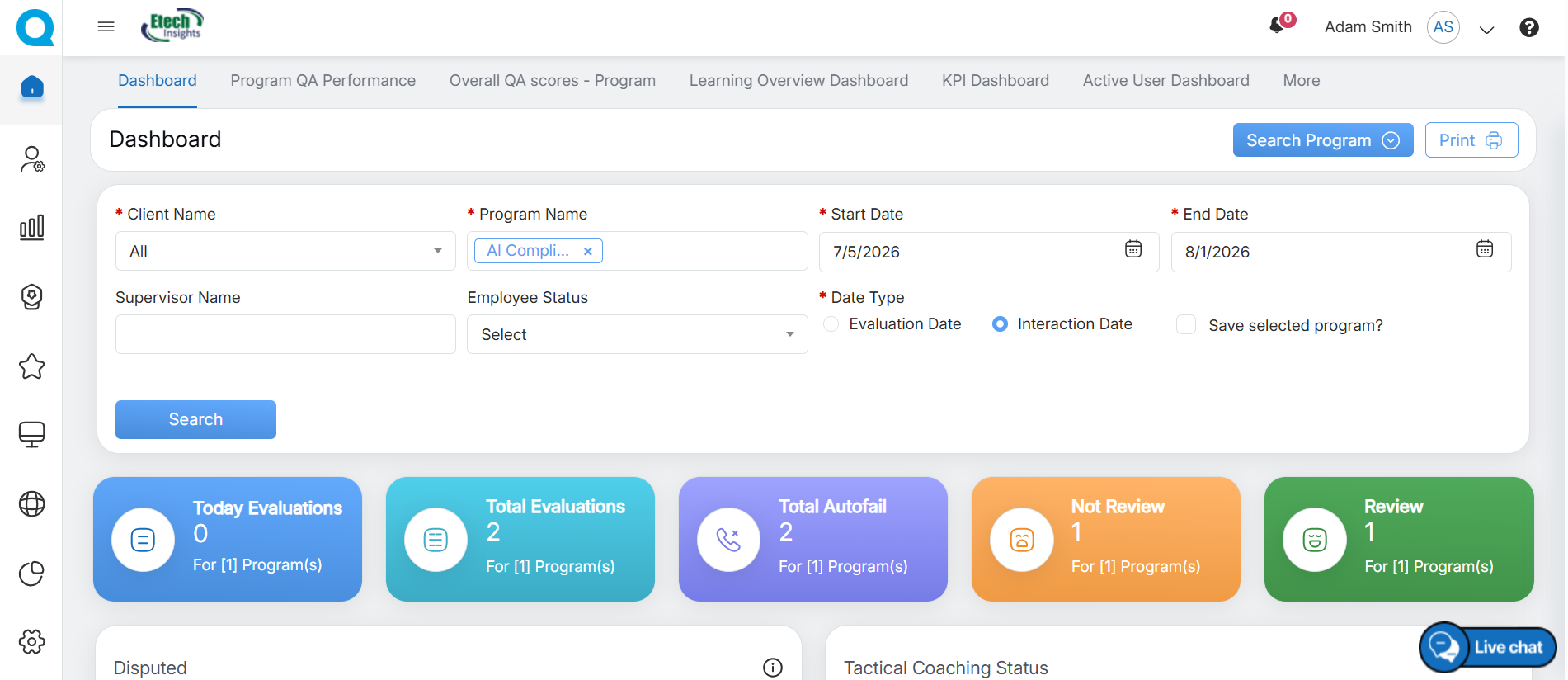
Admin Dashboard
After a successful login, the Admin Dashboard is displayed. The dashboard provides an overview of key information and gives quick access to the features and modules available to the Admin, as shown below.
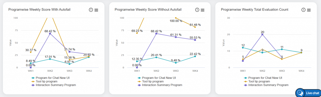
Analytical Metrics and Performance Statistics
The Dashboard displays various analytical metrics and performance statistics. Scroll down to view additional charts, reports, and insights based on different parameters and data categories.
The graphical representation of data will be displayed as shown below.
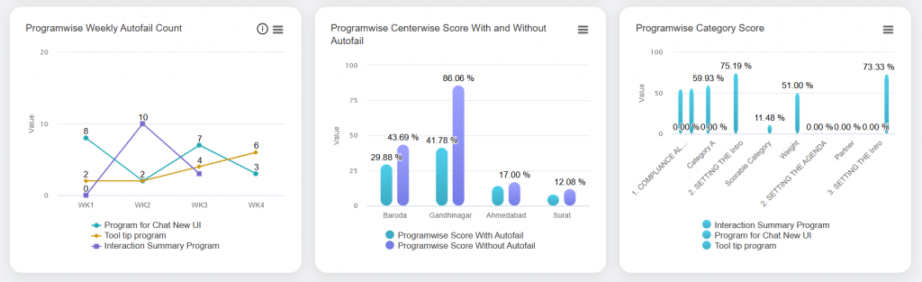
Graphical Representation of Data
To display specific data on the Dashboard, apply the required search filters. Click Search Program to select the desired criteria.
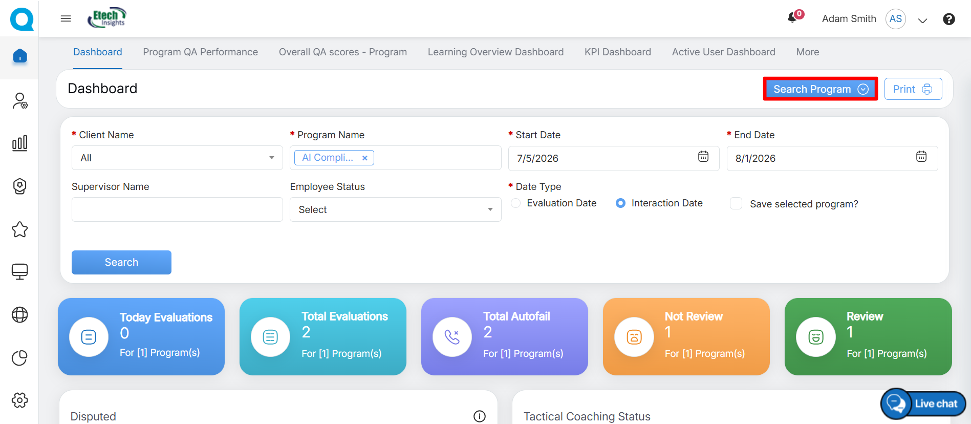
Search Program
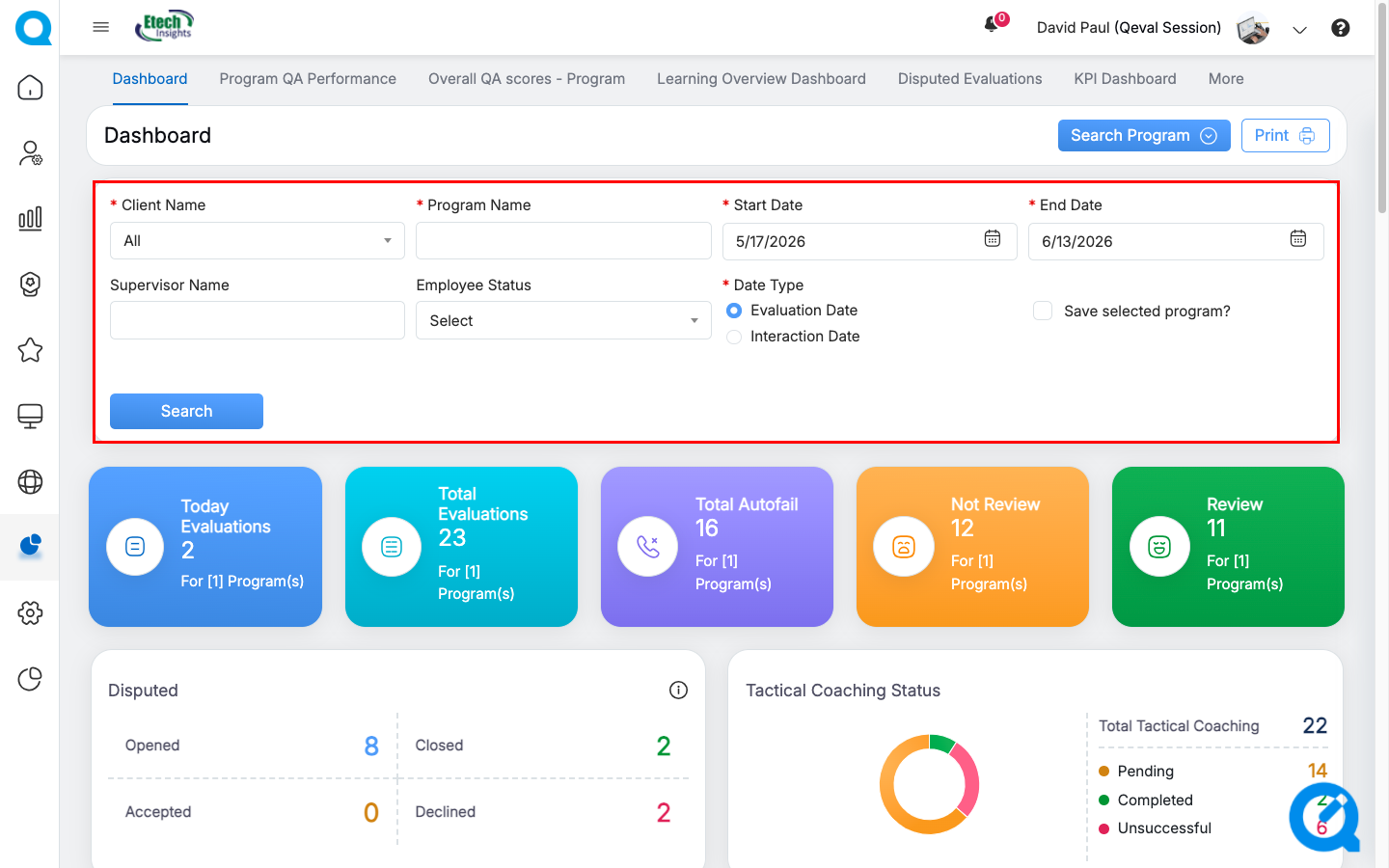
The dashboard displays the data based on the selected search criteria. Admin users can view the performance data across multiple Programs, Centers, and Categories simultaneously.
The following data will be displayed on this page:
|
Dashboard Elements |
Description |
|
Today’s Evaluation |
Displays the total number of evaluations done for the current day. |
|
Total Evaluation |
Displays the total number of evaluations for the specified date range. |
|
Total Autofail |
Displays the total number of autofail that occurred for the specified date range. |
|
Not Reviewed |
Displays the total number of evaluations that have not been reviewed. |
|
Reviewed |
Displays the total number of evaluations that have been reviewed. |
|
Disputed |
Displays the total number of disputes in the following states:
|
|
Programwise Charts |
Displays weekly data for: Score with and without Autofail These statistics are displayed in the Line Chart format. On these charts, the weekly score is displayed for each program.
Click on the program name(s) displayed below the chart to view the statistics of only that specific program(s) as shown below:
Then, the statistics of only the selected program(s) will be displayed as shown below:
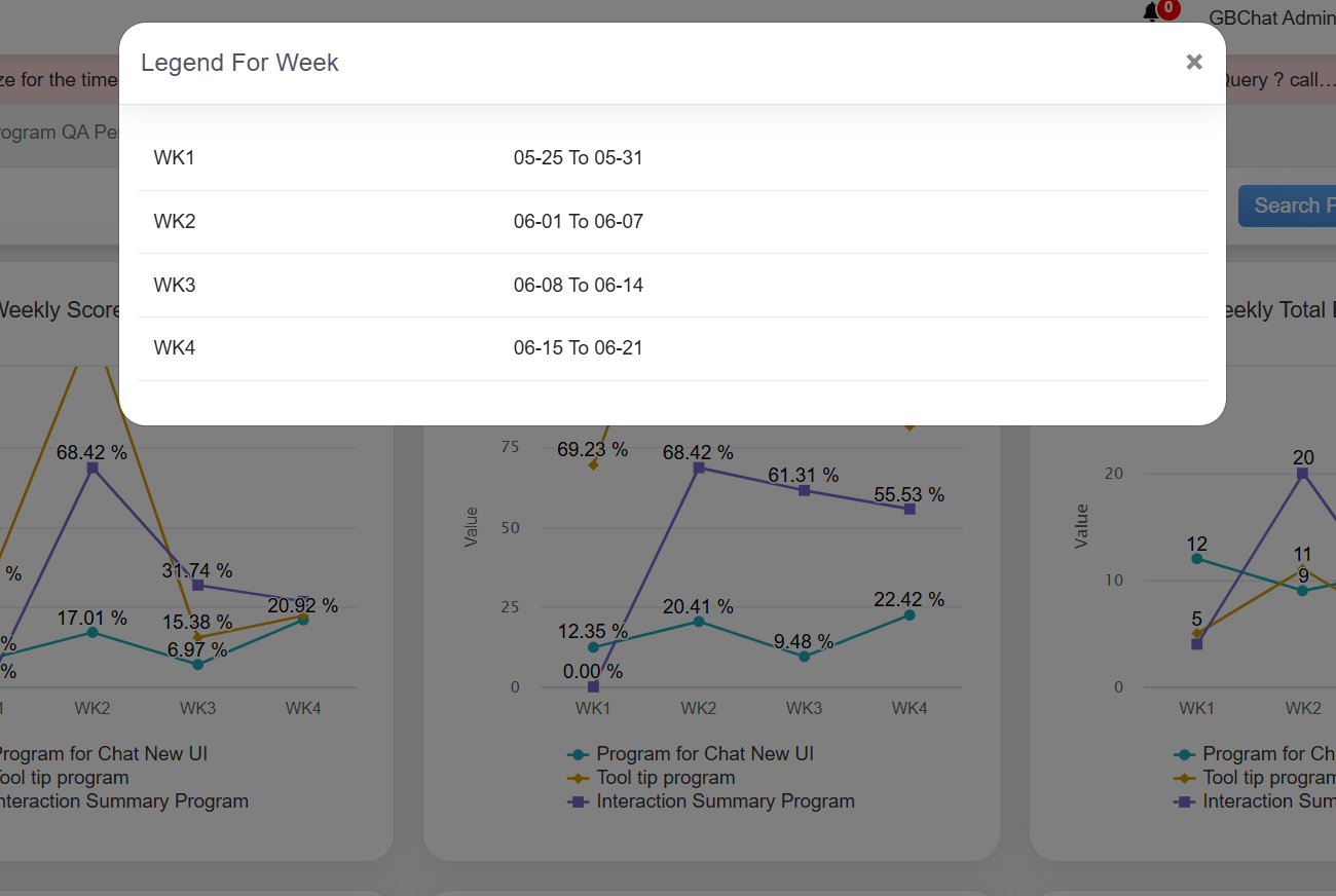
Similarly, admin user can view the chart of the Weekly Score without Autofail for specific programs. To view the legends, click on the Legend For Week as shown below.
The Legend For Week window will be displayed as shown below:
In this window, the date range of each week will be displayed for which the data is displayed for the Programwise Weekly Score with Autofail and Programwise Weekly Score without Autofail in the Line Chart format. Total Evaluation Count and Autofail Count These statistics are displayed in the Line Chart format. On these charts, the weekly count is displayed for each program.
Click on the program name(s) displayed below the chart to view the statistics of only that specific program(s) as shown below:
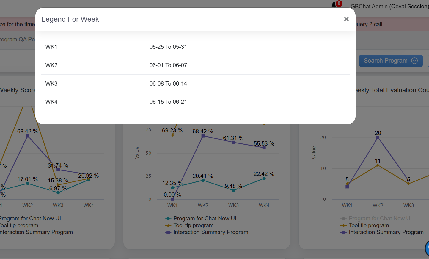
To view the legends, click on the Legend For Week as shown below.
The Legend For Week window will be displayed as shown below:
In this window, the date range of each week will be displayed for which the data is displayed for the Programwise Weekly Total Evaluation Count and Programwise Weekly Autofail Count in the Line Chart format. Centerwise Score with and without Autofail and Category Score These statistics are displayed in the Bar Chart format. The following chart displays the statistics of both programwise scores achieved by the agents with and without the Autofail on a weekly basis for different centers (left image) and the statistics of QA scores achieved by all the agents category-wise (right image).
Click on the Programwise Score With Autofail displayed below to view the statistics of only scores with autofail.
The statistics of only scores with autofail achieved by the logged-in admin user will be displayed:
Similarly, click on the Programwise Score With Autofail and the statistics of only scores without autofail achieved by the logged-in admin user will be displayed:
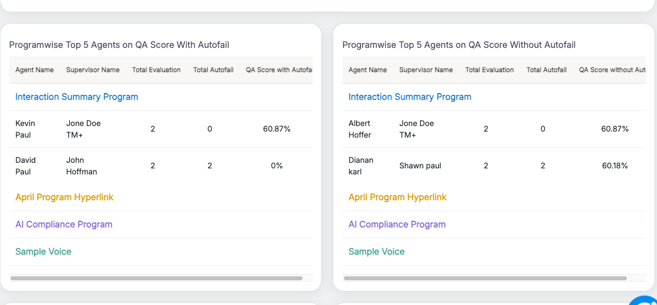
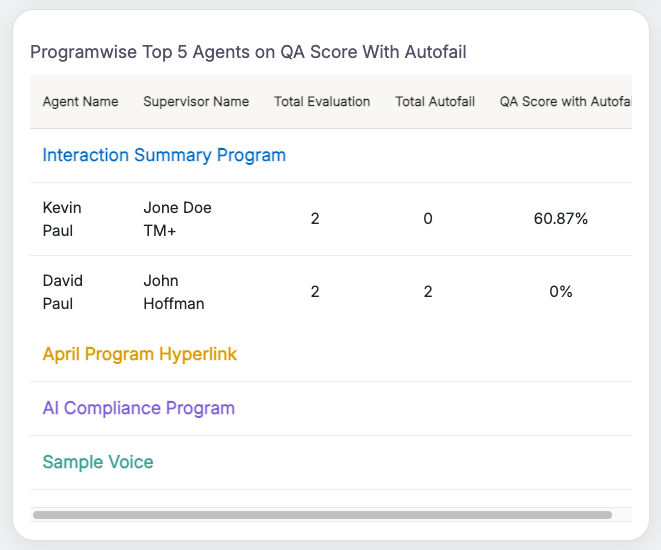
Top 5 Agents on QA Score with and without Autofail These statistics are displayed in the Table format. The following table displays the statistics of both programwise QA scores achieved by the top 5 performing agents with and without the Autofail on a weekly basis.
Admin user can view the QA scores for each program by clicking on the program name as shown below:
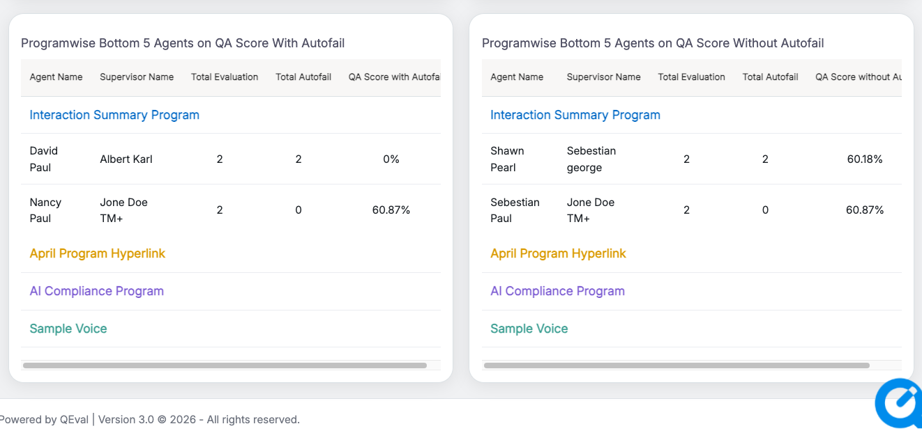
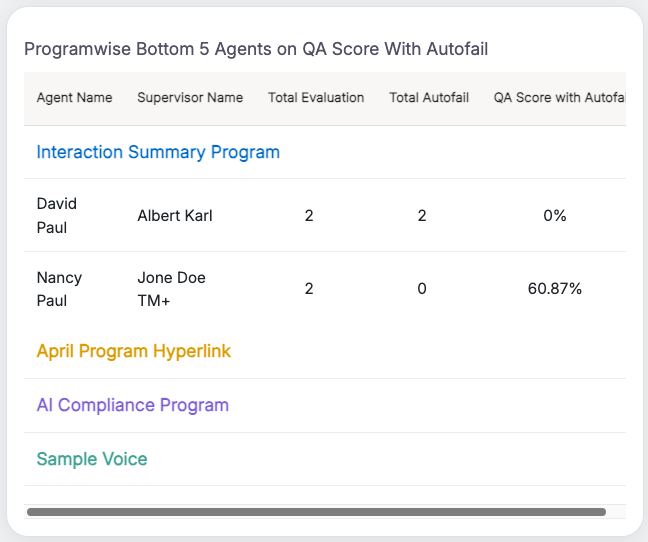
Bottom 5 Agents on QA Score with and without Autofail These statistics are displayed in the Table format. The following table displays the statistics of both programwise QA scores achieved by the bottom (poor) 5 performing agents with and without the Autofail on a weekly basis.
Admin user can view the QA scores for each program by clicking on the program name as shown below:
|
| Tactical Coaching
|
Tactical coaching graphs assist the logged-in user to access the comprehensive agent-level coaching data. These statistics are displayed in the Bar Chart format as shown below:
Click on the individual agent’s name displayed below the chart to view the status of only that specific agent as shown below:
Then, the status of Accept, Decline, and Pending cases of that specific agent will be displayed as shown below:
|
| Tactical Coaching Status |
Tactical coaching status statistics are displayed in the Pie Chart format. On this chart, the user can view the number of completed, pending, and unsuccessful coaching status as shown below:
|








For each statistic displayed on the Dashboard, the logged-in admin can perform the following actions:
View the Statistics on Full Screen
Admin can view all the stats of the Dashboard in full-screen mode. To do so, click on the Chart Context Menu icon which is highlighted on the following screen.

Chart Context Menu
Then, click on the View in full screen option.

View in full screen
The data will be displayed in the full-screen mode as shown below:
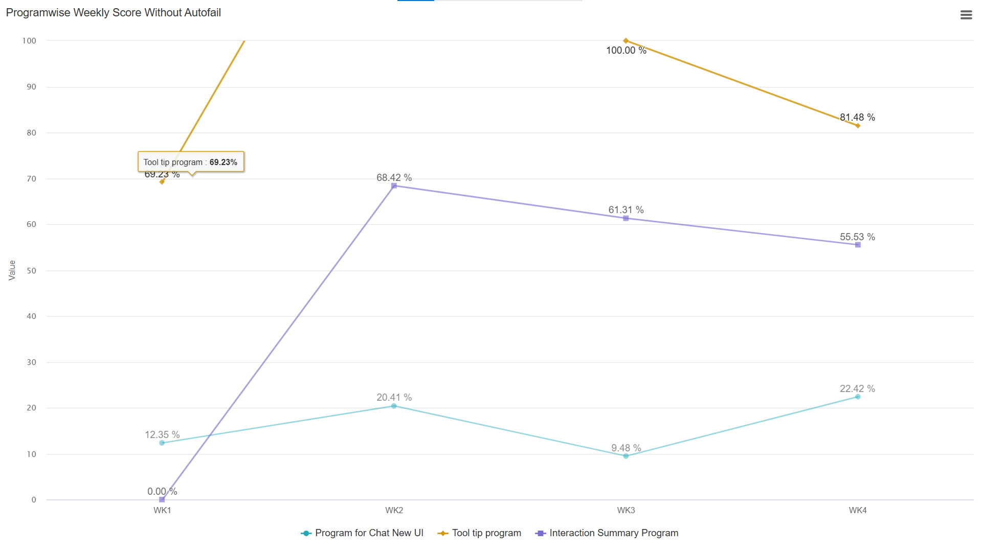
Data in full screen mode
To exit the full-screen mode, click on the Chart Context Menu  icon and select the Exit from full screen option as shown on the following screen:
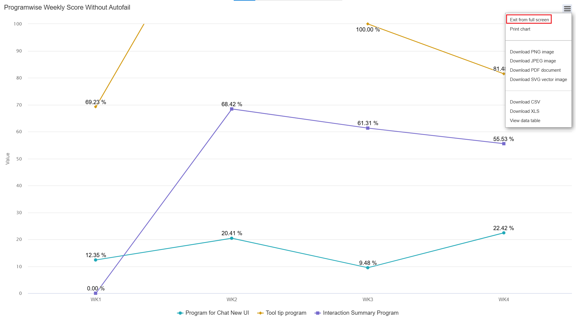
Exit from full screen
Print Chart
Admin can print the chart and save it in their local system as well. To do so, click on the Chart Context Menu icon and select the Print Chart option.
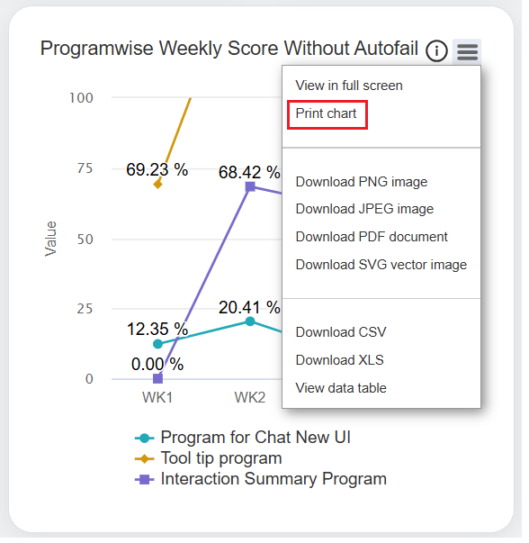
Print Chart
Download Chart
Admin can download each chart/statistic displayed on the Dashboard in:
- PNG image
- JPEG image
- PDF document
- SVG vector image
Agents can also download the data in CSV and XLS format as well.
To download this information in any of the above-mentioned formats, then click on the Chart Context Menu icon and select the required format.
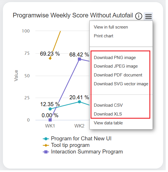
Download Formats
The particular information will be downloaded into the local system.
View Data Table
Admin can view the data in the table format which is initially displayed in the Chart format. To do so, click on the Chart Context Menu icon from the required category and select the View data table option.
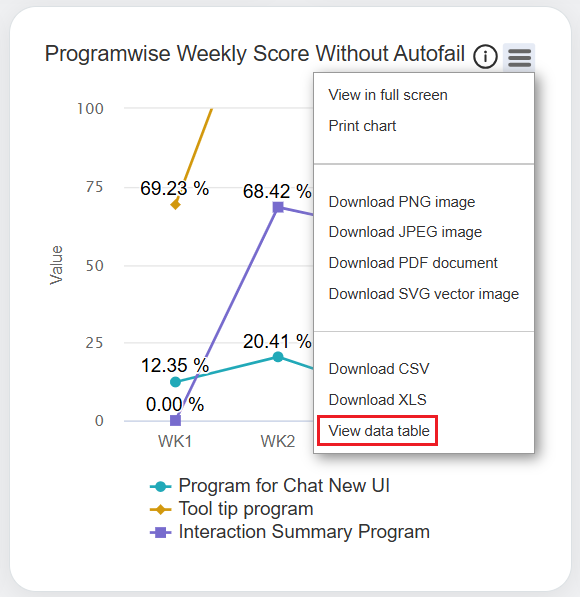
View Data Table
The data table will be displayed for the particular category as displayed below:
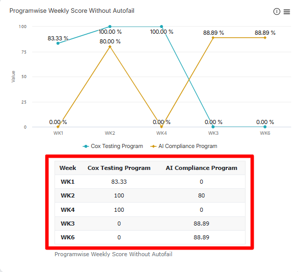
Data Table Results
Program QA Performance
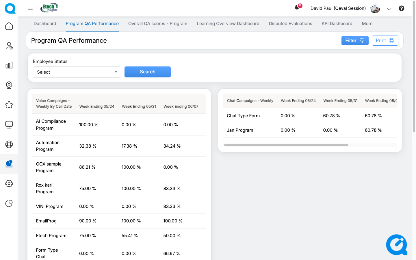
Program QA Performance
On the Program QA Performance page, the Admin can view weekly performance data for both Voice Campaigns and Chat Campaigns.
Use the Employee Status filter to display results based on the required agent status. You can choose Active, Inactive, or All to refine the data displayed.
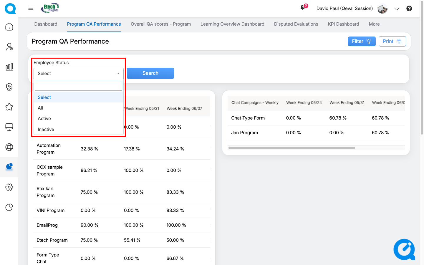
The data also consists of an added field Trend.
The admin can print the data by clicking on the Print button.
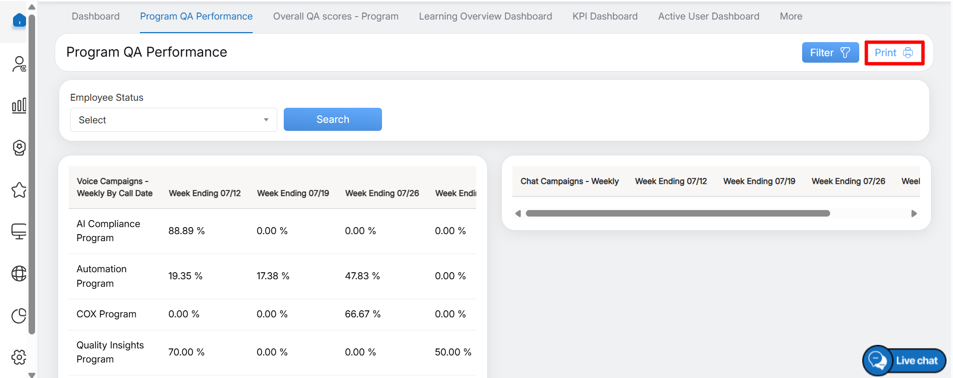
Then the data will get downloaded into the system.
Overall QA Scores – Program
On the Overall QA Score page, the Admin can view QA score data in the following formats:
- QA scores – Week Wise, Center Wise, Category Wise
- Weekly Top 3 Defects Category.
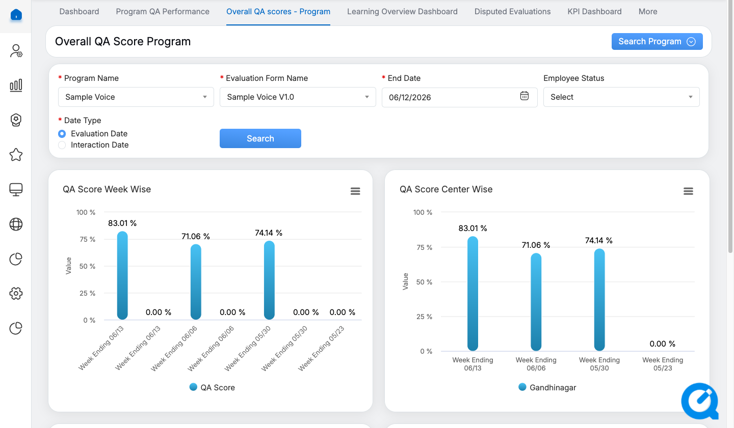
Overall QA Scores – Program
To display specific data on this page, configure the following search filters:
- Program Name: Select the required program from the drop-down list.
- Evaluation Form Name: Select the required evaluation form. The available forms are displayed based on the selected program.
- End Date: Select the required end date using the date picker.
- Employee Status: Select Active, Inactive, or All to filter the results by agent status.
- Date Type: Select either Evaluation Date or Interaction Date.
Note: In QEval AI instances, Interaction Date is selected as the default Date Type in the filter panel. You can change the Date Type to Evaluation Date whenever required.
After configuring the required filters, click Search to display the data based on the selected criteria.
QA Score Week Wise and QA Score Center Wise
These statistics are displayed in the Bar Chart format.

QA Score Week and Center Wise
The following chart shows the QA scores achieved by all agents, displayed week-wise and center-wise.
QA Score Category Wise
These statistics are displayed in the Bar Chart format.
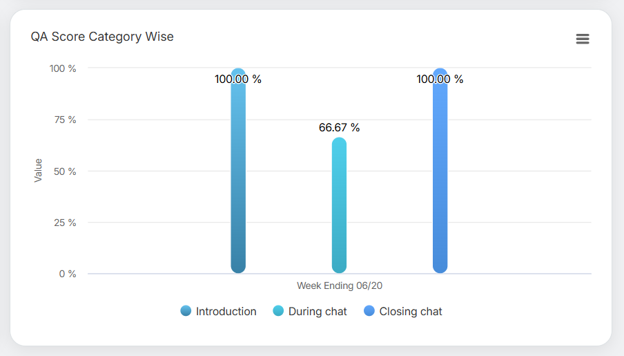
The following chart displays the QA scores achieved by all agents, organized category-wise.
QA Score Category Wise
The above screen displays the data for different categories for every week ending like:
- Introduction
- During chat
- Closing chat
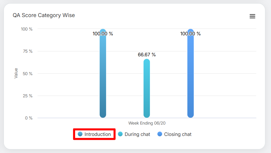
To view statistics for specific categories, click the required category names displayed below the chart. The chart updates to display data only for the selected categories, as shown below.
Category Names
Weekly Top 3 Defects Category
These statistics are displayed in the Bar Chart format.
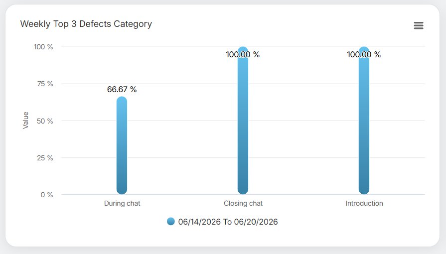
Weekly Top 3 Defects Category
The following chart displays the statistics of the top 3 defects category on weekly basis.
To view statistics for one or more specific weeks, click the required week(s) displayed below the chart. The chart updates to display data only for the selected week(s), as shown below.
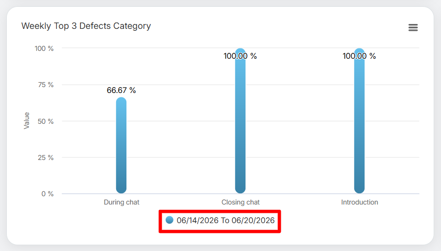
Date Range
To view data for a different week or week range, select the required week(s) below the chart. The chart refreshes to display statistics for the selected period.
Learning Overview Dashboard
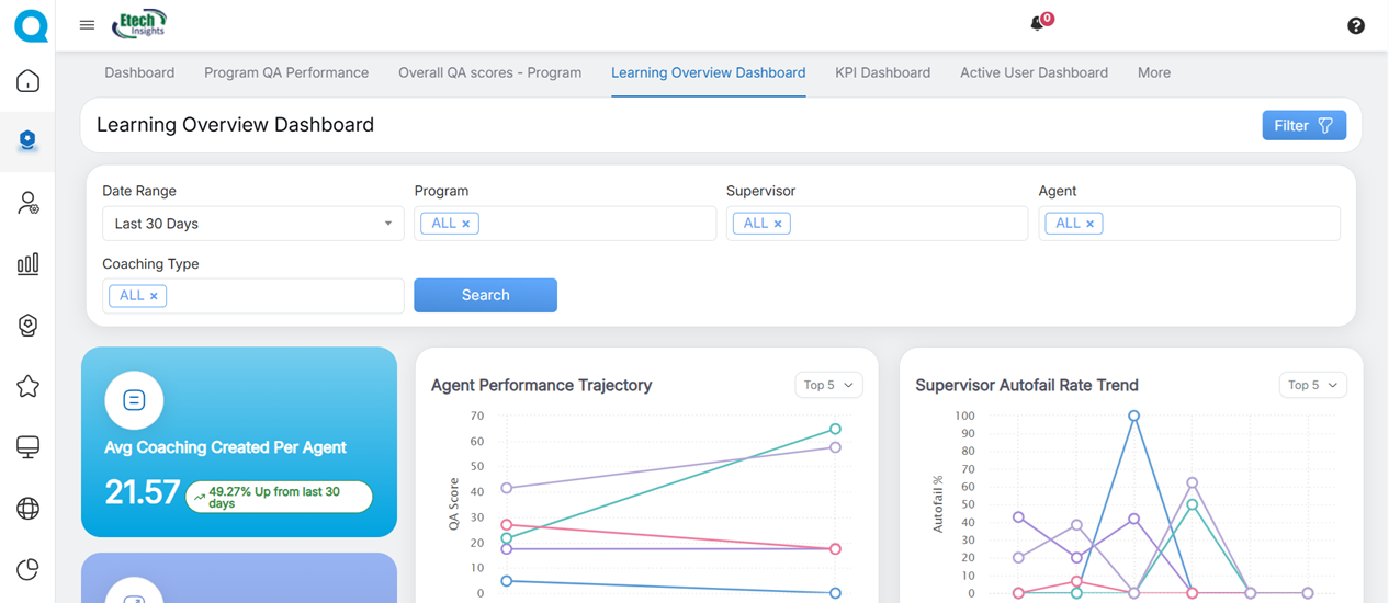
Learning Overview Dashboard
The Learning Overview dashboard provides insights into the performance of QEval’s active learning process. It helps Admins monitor disputed evaluations, identify evaluations that require human review, and surfaces model performance trends.
To display specific data on this page, configure the following search filters:
- Date Range: Select the required date range. By default, Last 30 Days is selected. Available options include Last 7 Days, Last 15 Days, Last 30 Days, Last 90 Days, and Last 120 Days.
- Program Name: Select the required program from the drop-down list.
- Supervisor: Select one or more supervisors from the drop-down list.
- Agent Name: Select one or more agents from the drop-down list.
- Coaching Type: Select the required coaching type from the drop-down list.
After configuring the required filters, click Search to display the data based on the selected criteria.
|
Dashboard Elements |
Description |
|
|---|---|---|
|
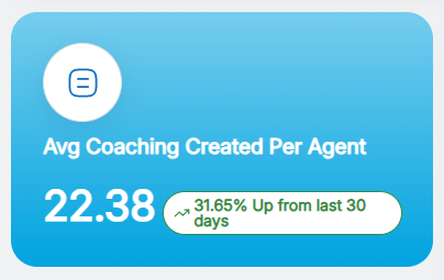
Average Coaching Created Per Agent |
|
|
|
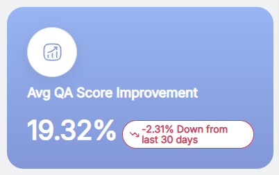
Average QA Score Improvement |
This metric measures the impact of coaching on QA performance by showing the percentage improvement in average QA scores for the selected date range and comparing that period with the previous equal time period; a positive percentage indicates scores improved during the selected period, a negative percentage indicates a decline that may require coaching adjustments, and a value near zero shows little or no measurable change.
|
|
|
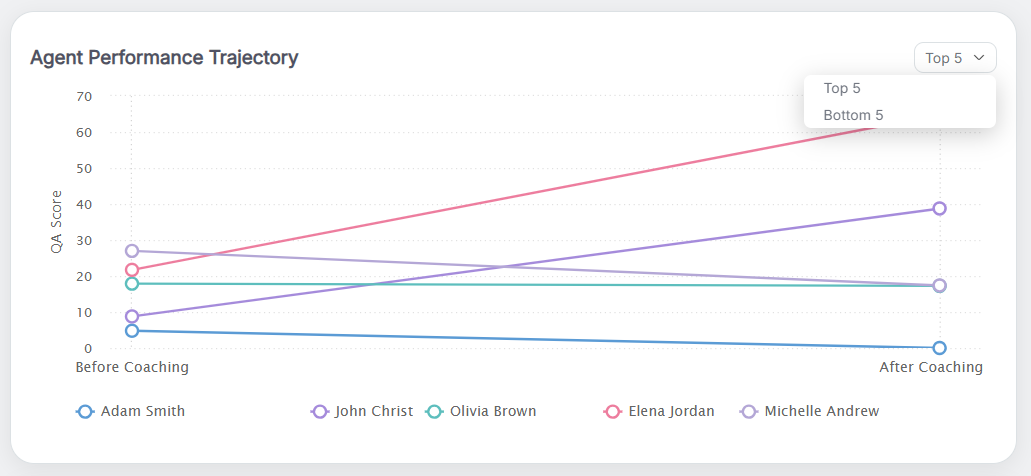
Agent Performance Trajectory |
This graph represents QA score and Auto Fail rate over time, defaulting to the Top 5 agents by improvement (toggle to Bottom 5 to find agents needing coaching); each agent has a distinct color, hovering reveals the agent name, color, and coaching created in the current date range, trends compare the selected period with the previous equal period, and if fewer than five agents are selected the Top/Bottom toggle is disabled and the chart shows only the selected agents. The system displays the Top 5 agents based on improvement trends. Users can also switch to Bottom 5 agents to identify who needs more coaching or support.
|
|
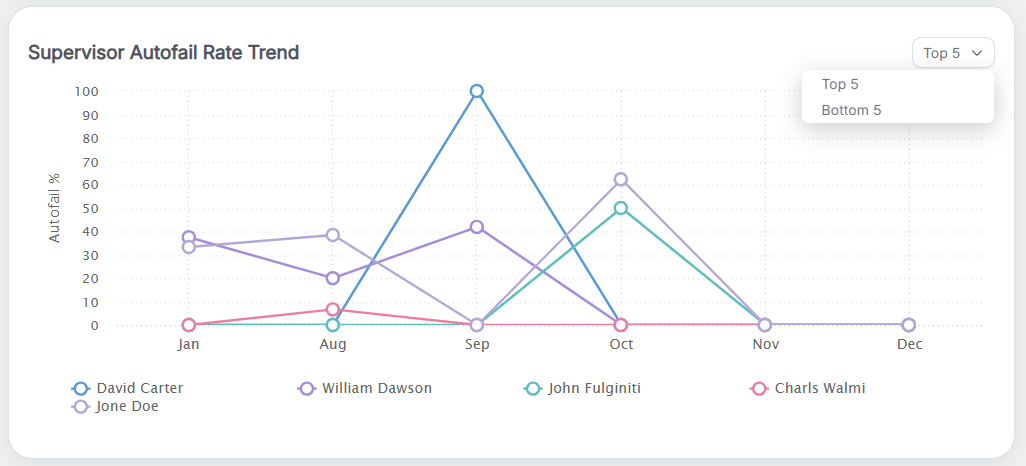
| Supervisor Autofail Rate Trend
|
This graph displays supervisors’ Auto Fail % over the last five months, defaulting to the Top 5 supervisors by performance with an option to toggle to Bottom 5. |
|
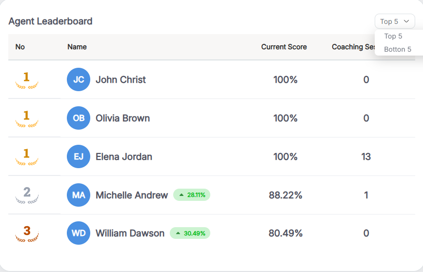
| Agent Leaderboard |
By default, the leaderboard shows the Top 5 agents and displays each agent’s performance improvement percentage (current date range vs the previous equal period), current QA score with Auto Fail rate, and number of coaching sessions completed; supervisors can toggle to Bottom 5 to identify agents who may need additional support.
|
|
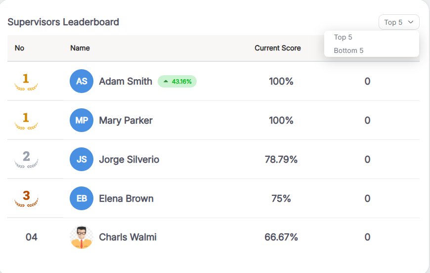
| Supervisors Leaderboard |
By default the view shows the Top 5 supervisors and displays each supervisor’s performance improvement percentage (current date range versus the previous equal period), their overall QA score with Auto Fail rate for the agents they supervise, and the number of coaching sessions they have created; this helps identify strong mentors who are positively impacting quality, and users can toggle to Bottom 5 as needed.
|
|
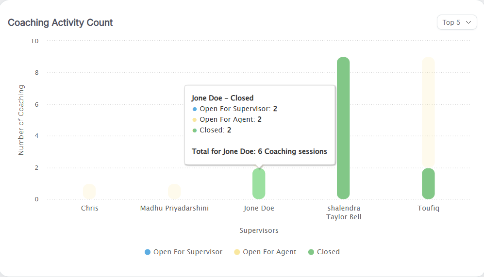
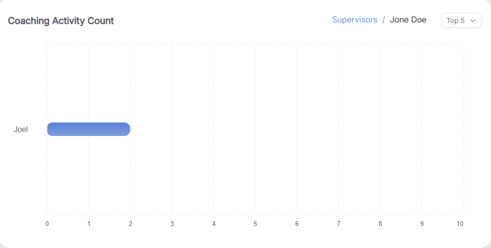
| Coaching Activity Count |
The Coaching Activity Count graph lists supervisors with their total coaching counts, displaying each supervisor as a stacked, color‑coded bar that breaks down counts for Open for Supervisor, Open for Agent, and Closed. The chart supports drilldown and hover interactions: clicking a chart element opens a detailed view showing the underlying records and breakdowns, while moving the cursor over an element displays a tooltip with the count and other summary details. |
|
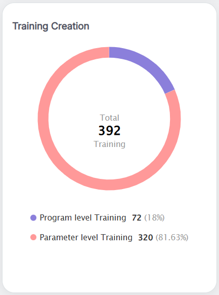
| Training Creation |
This pie chart breaks down training created in the selected date range into program‑level and parameter‑level categories, displays matching color codes below the chart, and shows the count of trainings per program or parameter on hover, helping users quickly see what types of training content were developed.
|
|
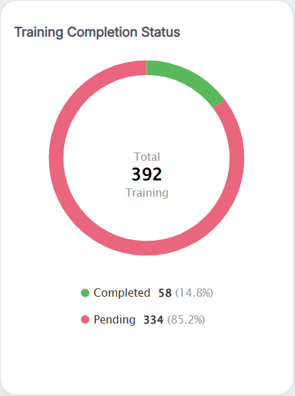
| Training Completion Status |
This pie chart shows the number of training sessions Completed and Pending for the selected date range, with matching color codes displayed below the chart; hovering over each segment reveals the count for that status, providing a quick view of overall training participation and progress.
|
|
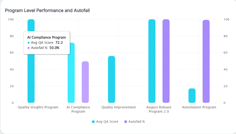
| Program Level Performance and Autofail |
This graph displays each program’s average QA score alongside the total number of coaching sessions conducted for that program over the selected date range, helping users identify high‑performing programs and those needing additional coaching; hovering the QA score trend line reveals the program name and its average score, and hovering the coaching data shows the program name and the number of coaching sessions created.
|
|
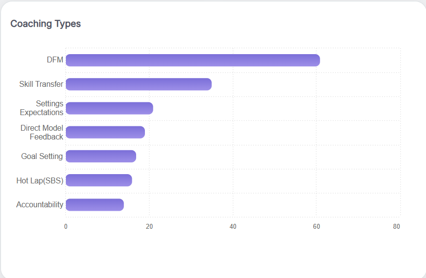
| Coaching Types |
This bar chart shows the number of coaching sessions for each coaching type in the selected date range, helping users identify the most‑used types, those needing more attention, and how coaching resources are allocated; hovering a bar reveals the coaching type and the total sessions created.
|
KPI Dashboard
The KPI Dashboard displays the scores achieved by all agents across different performance categories.
- Program Level Score Comparison
- KPB Index
- Strategic Parameter Score
- Prediction Score Based on Strategic Parameter Monthly
- Prediction Score Based on Strategic Parameter – Quarterly
- Top 5 Agents KPI
- Bottom 5 Agents KPI
- Coach (Tactical Warehouse)
- Highest & Lowest Daily Score
To view these scores, navigate to the KPI Dashboard from the Home page of the Agent Console, as shown in the following screen.
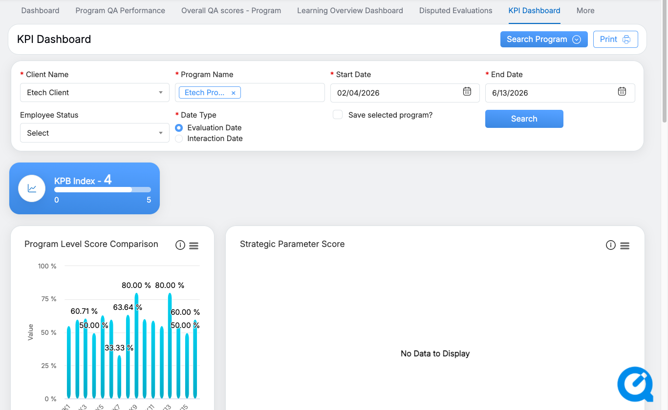
KPI Dashboard
To view data for a specific time period, click Search Program and select the required search criteria, as shown below.
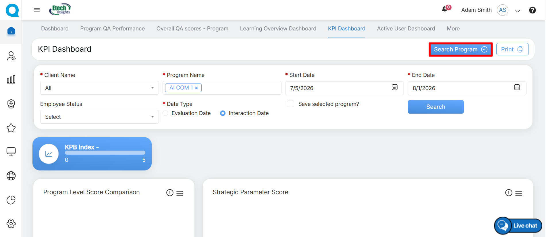
Search Program
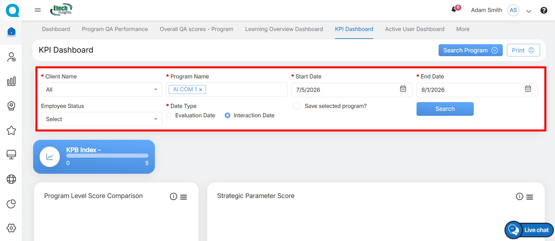
Select the Save Selected Program? checkbox to save the selected program for future statistic searches.
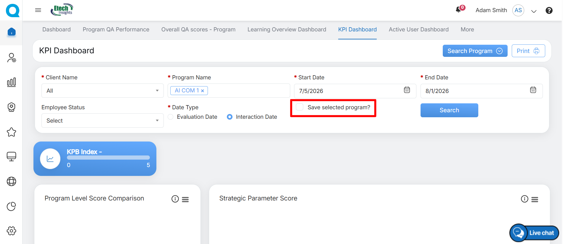
Save selected program
Once all details are configured, click Search to view the KPB index, score comparisons, and predicted performance.
Admin can scroll down to view more reports.
The following reports will be displayed on this page:
|
Reports |
Description |
|---|---|
|
Program Level Score Comparison |
Displays the week-wise comparison of the program average score which is the average of the performance of all the agents. This data is displayed in the Bar Chart format. To view the legends, click on the Legend For Week as shown below.
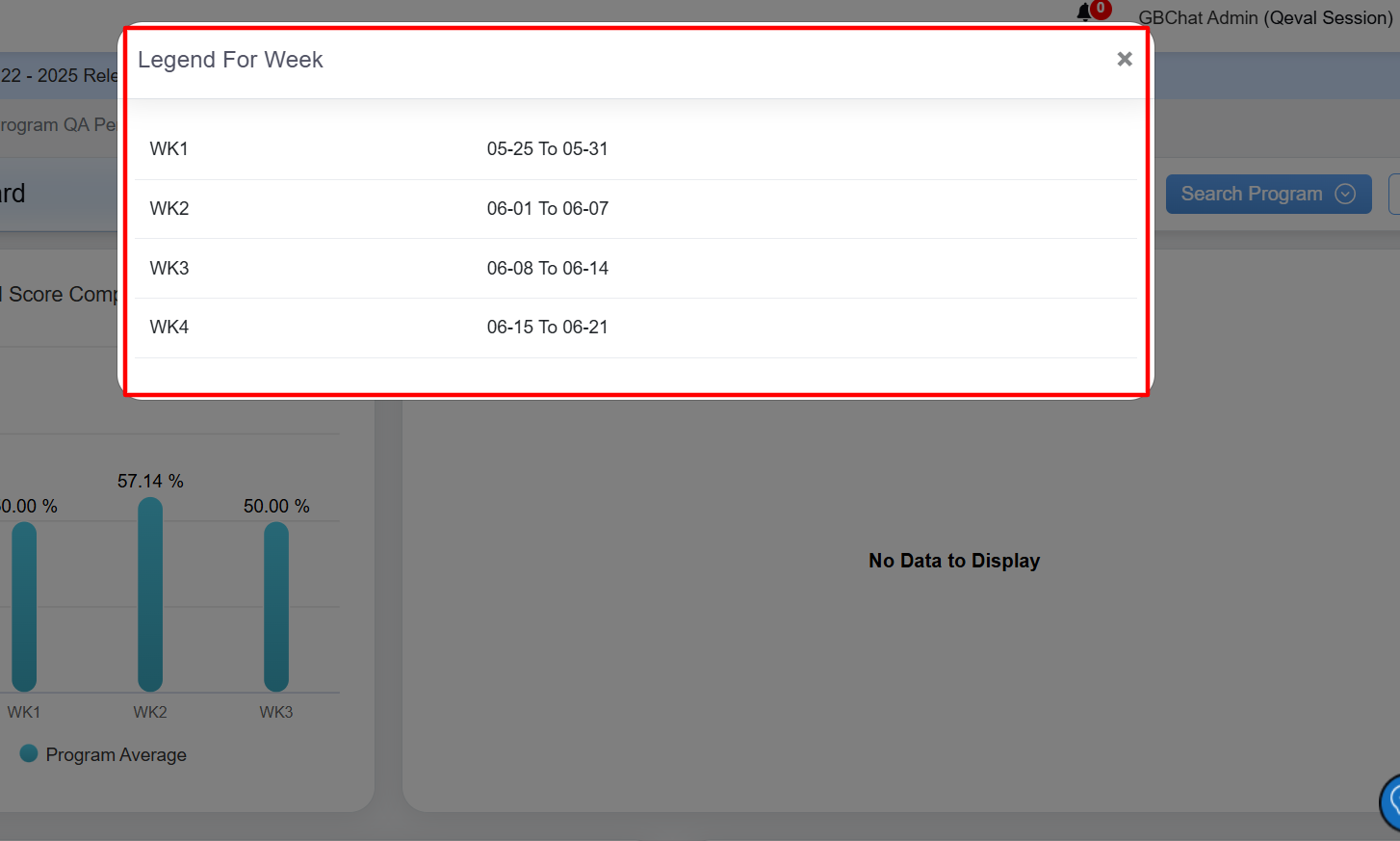
The Legend For Week window will be displayed as shown below:
In this window, the date range of each week will be displayed for which the data is displayed for the Program Level Score Comparison in the Bar Chart format. |
|
KPB Index |
Displays the overall Key Performance Behaviour Index of all the agents. |
|
Strategic Parameter Score |
Displays the overall Strategic Parameter Score achieved by all the agents. To view the legends, click on the Legend For Week displayed under the chart. |
|
Prediction Score Based on Strategic Parameter Monthly |
Displays the overall Prediction Score based on the Strategic Parameter Score achieved by the agent on a monthly basis in the Line Chart format.
|
|
Prediction Score Based on Strategic Parameter – Quarterly |
Displays the overall Prediction Score based on the Strategic Parameter Score achieved by the agent on a quarterly basis in the Line Chart format.
|
|
Top 5 Agents KPI |
Displays the KPI data of the top 5 agents. |
|
Bottom 5 Agents KPI |
Displays the KPI data of the bottom 5 agents. |
|
Coach (Tactical Warehouse) |
Displays the data of – before the week, during the week, and after the week – for the Coach Tactical Warehouse in the Line Chart format.
Admin can also view the data of one, multiple, or all the coaches by selecting the names displayed at the bottom of the chart. |
|
Highest and Lowest Daily Score |
Displays the overall highest and the lowest score achieved by all the agents on a daily basis. The following chart displays the statistics of both High and Low Scores achieved by all the agents on a daily basis.
Click on the High Score displayed below to view the statistics of only High Scores.
The statistics of only High Scores achieved by the logged-in agent will be displayed:
Similarly, click on the Low Score and the statistics of only Low Scores achieved by the logged-in agent will be displayed:
|



Active User Dashboard
The Active User Dashboard provides information about the total active hours of users in the system. When you click the Active User Dashboard tab, the system opens the dashboard, where you can view the total active hours for the following user roles:
- Admin
- QA Verifier
- QA Supervisor
- Supervisor
This is as displayed below:
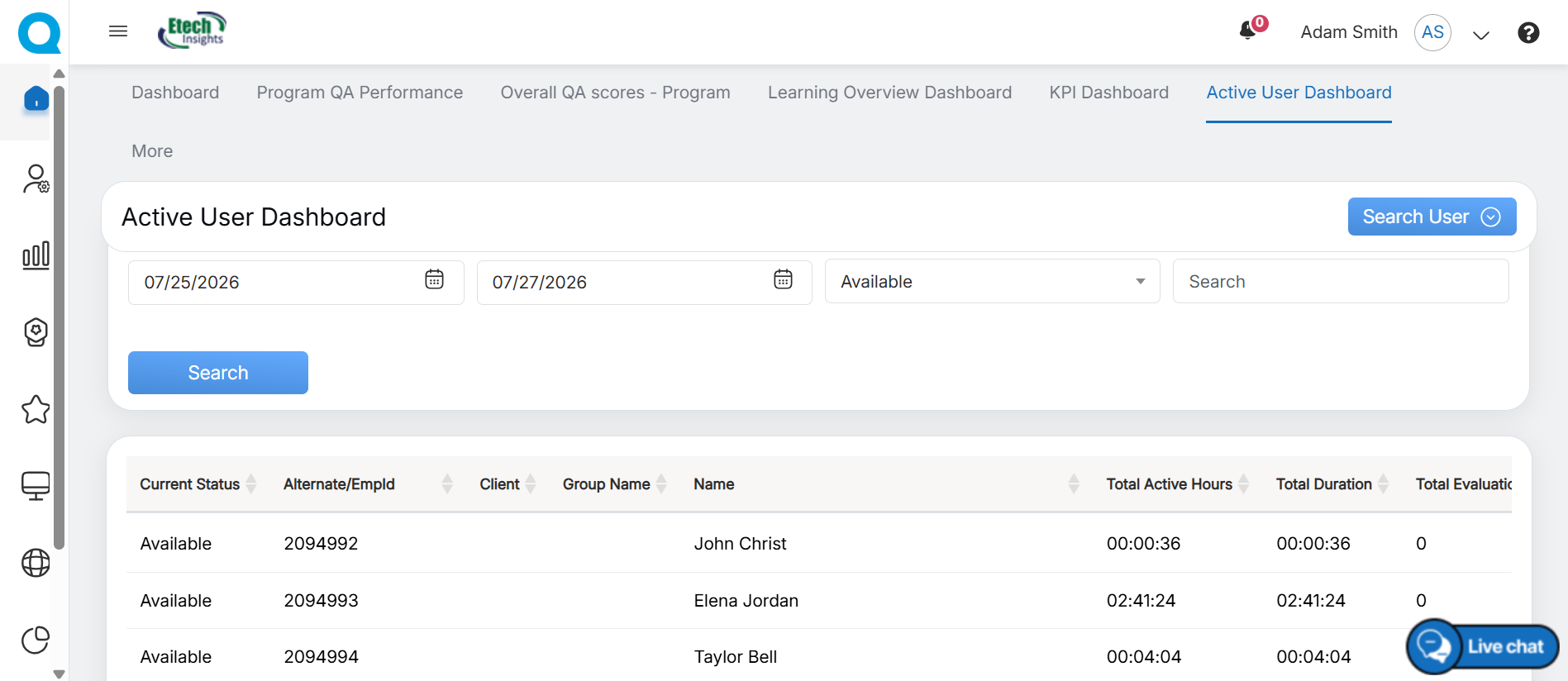
Active User Dashboard
By default, the Active User Dashboard displays the active hours for the current day. To view active hours for a different time period, click Search User and select the required date range. The dashboard updates to display the active hours for the selected duration.
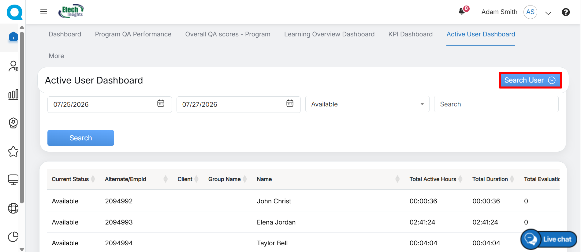
Search User
Configure the following search criteria to filter the data:
- Start Date: Select the start date using the date picker.
- End Date: Select the end date using the date picker.
- Status: Select the required status from the drop-down list.
- Search: Enter a keyword to search for a specific user or related information.
After configuring the required filters, click Search to display the matching results.
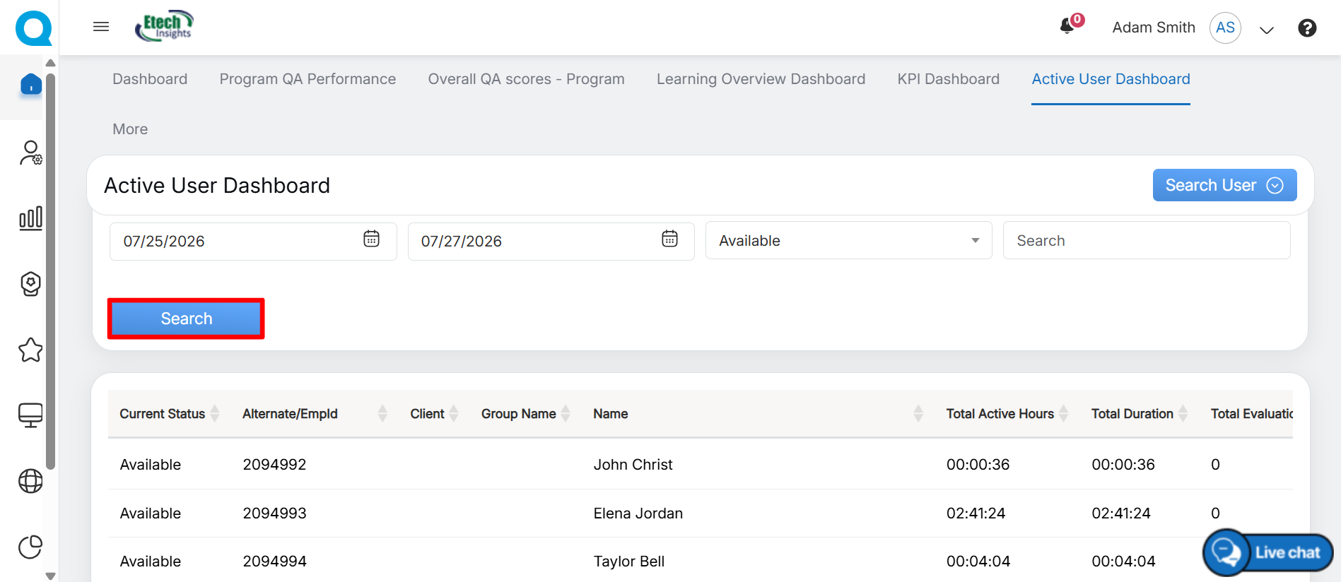
Search Details
Based on the set filters, the data will be displayed on the grid accordingly. The table will display the following details:
- Current Status
- Alternate/EmpId
- Client Name
- Group Name
- Name of the users
- Total Active Hours
- Total Duration
- Total Evaluation
Notes
- The total active hours will not include the time period when the member has set their status as “Not Available”.
- The active hours’ data will be displayed in the CST zone.
Video